Tag Archives: new york times

The New York Times’ history of covering (up?) breast cancer

After Roger Ebert’s death last week, I picked up The Emperor of All Maladies: A Biography of Cancer, by Siddhartha Mukherjee, which was recommended during a discussion on how the war on cancer seemed hopeless. I’m not finished with the book yet, but I can already recommend it for being one of the best medical non-fiction books I’ve ever read.

The facts in Mukherjee’s “biography of cancer” seem to indicate that “no simple, universal, or definitive cure is in sight – and is never likely to be”, but Mukherjee also believes that medical science continues to make profound progress in understanding and treating cancer. And if anything, we might be farther along had we funded cancer research with the resources and commitment it requires.

After World War 2 drained interest and funding from cancer research, Mukherjee writes, “cancer again became the great unmentionable, the whispered-about disease that no one spoke about publicly.” As an example, he retells a story from the 2001 book, The Human Side of Cancer, in which a breast cancer activist describes being shunned by the New York Times:

In the early 1950s, Fanny Rosenow, a breast cancer survivor and cancer advocate, called the New York Times to post an advertisement for a support group for women with breast cancer. Rosenow was put through, puzzlingly, to the society editor of the newspaper. When she asked about placing her announcement, a long pause followed. “I’m sorry, Ms. Rosenow, but the Times cannot publish the word breast or the word cancer in its pages. “Perhaps,” the editor continued, “you could say there will be a meeting about diseases of the chest wall.” Rosenow hung up, disgusted.

The original source for Rosenow’s story – The Human Side of Cancer, by Dr. Jimmie C. Holland – has an upbeat coda:

However, [Rosenow and her friend] persisted, and their devoted efforts resulted in what is widely known as Reach to Recovery, a worldwide support program for women with breast cancer, administered today through the American Cancer Society.

Sixty-five years after the era of the Cleaver family, we’re still having serious debates over whether mothers should be allowed to breast-feed children in public. And Lady Justice herself was shamed about her wardrobe malfunction not too long ago. That the Times, still a stodgy paper today, would be too squeamish 65 years ago to print the word “breast” seems, well, self-evident. And so Rosenow’s story has been repeated in much of the major media coverage of Mukherjee’s book, including NPR, the Boston Globe, and even the New York Times itself.

What Ms. Rosenow described may have actually happened (it’s not like she or the Times society editor had Google or Lexis-Nexis back then), but a quick search of the New York Times digital archive shows that the Times had published articles about breasts and cancer throughout the 1950s.

For example, on September 24, 1950, the Times ran a story headlined “Movie Aids Cancer Detection:”

A color film designed to aid women in recognizing early signs of breast cancer is available for showings before Brooklyn women’s groups. Titled “Breast Self-Examination,” it was produced by the American Cancer Society and the National Cancer Institute of the United States Pubic Health Service.

Besides running notices of which local theaters were screening “Breast Self-Examination,” the Times also wrote several articles about the movie’s educational impact: “Cancer Film Saves Lives”, the Times reported on April 22, 1951. And, a year after the film’s introduction, the Times reported its success: 911,000 SAW CANCER FILM; Year’s Record Cited in Showing Self-Test for Women. And of course, the Times found fit to print the obligatory self-back-patting hug-your-newspaper-today feature: NEWSPAPER AID PRAISED; Cancer Experts Say Sufferers Gain by Care Publicity:

Newspapers and the radio were credited today with helping doctors fight cancer by causing sufferers to seek early treatment.

“There is no question but that the information made public by newspapers, radio, and other news services is making it possible for us to see patients with breast cancer earlier than ever before,” Dr. J. Elliott Scarborough, Jr., declared.

In fact, the breast cancer advice that the Times printed in 1952 doesn’t seem far removed from what you’d find in any contemporary medical column:

SELF-EXAMINATION URGED: Women Must Detect Early Stage of Breast Cancer, Doctor Says

If breast cancer is to be detected in its early stages, it is the women themselves who must do it…Dr. Haagensen said the breasts should be examined at least every two months to be reasonably sure they are free of cancer signs…Physicians, Dr. Haagensen said, should teach women self-examination.

Of course, cancer is a far more common topic of public concern and media coverage today. As Mukherjee himself points out, that’s because until relatively recently, humans generally didn’t live long enough to die from cancer. One of the earliest mentions of breast cancer in the Times archive occurs in 1852, in its column titled, Weekly Report of Deaths in the City and County of New York. Between January 10-17, the Times noted 324 deaths, the majority of them children. The top killers are diseases we rarely hear today: 54 deaths from consumption, 28 to convulsions, 20 to scarlet fever, 18 to “Dropsy in the head.” In contrast, “Cancer” and “Cancer of Breast” accounted for 1 death apiece. That cancer has become medicine’s public enemy number one is almost a sign of wealth and progress. In impoverished countries, cancer doesn’t even rank among the top 10 in causes of death.

If you’re interested in taking a depressing trip through medical history, type “cure for cancer” into the Times’ digital archive. You’ll find headlines from every decade – if not every one or two years – since 1852 touting a promising development in the fight against cancer:

If the war against cancer seems like an unending series of misguided schemes and false hope – much like our ongoing wars against terror, drugs, and poverty ‐ it’s because, like those wars, the enemy was never just one monolithic opponent that one kind of “weapon” (and lots of it) could ever defeat. So it’s fitting that the facts may be more complicated than they seem in Ms. Rosenow’s anecdote – because that’s the case with everything related to cancer. One of the most interesting things about Mukherjee’s attempt to write a “biography” of cancer is how, when the literary framing is inadequate for describing cancer, it serves only to more fully illuminate the scope of this war.
Reactions to Osama bin Laden’s death: Female and non-U.S. residents more ambivalent. Via the NYT Reactions Matrix

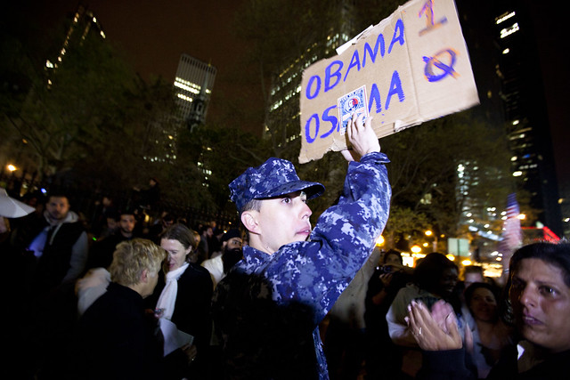
Obama 1, Osama 0

This (totally not-double-checked) analysis is a riff off of the excellent New York Times visualization (The Death of a Terrorist: A Turning Point?) of how people reacted to Osama bin Laden’s death. In the days following the news, the Times asked online readers to not only write their thoughts on bin Laden’s killing, but put a mark on a scatterplot graph that best described their reaction.

The Times used the data to show the continuum of reactions from everyone who participated. I wanted to see how reactions differed across geographical location and gender.

The Times collected about 13,000 reactions before closing it down. Besides the nature and content of reaction, users had the choice of leaving their names and geographical areas.

I used Google Refine to quickly sort out the geographic locations (which varied from zip codes, to city/state, to neighborhoods, such as “Upper East Side”). Gender was not a checkbox in the NYT’s form, so I used Refine to sort based on first names. More details in the methodology section.

Conclusion

The conclusion my totally-unscientific analysis came to: Among all NYT website users, there was general moral approval and optimism for killing bin Laden. This did not vary significantly among U.S. citizens, whether they were from the cities attacked on Sept. 11 or elsewhere.

However, non-U.S. NYT-website-users were less supportive of the action. This gap of moral approval also exists between male and female NYT-website-users and at roughly the same magnitude (about 10 points).

There wasn’t much variation in terms of how significant NYT-website-users believed OBL’s death would be. All demographic groups averaged about 60 (out of 100) in terms of how significant they rated OBL’s death in the war on terror.

In case you’re wondering: the 260 non-U.S.-female respondents averaged a 43 in positivity, which is a whole step below the average female response. U.S. females (2,270 of them), averaged a 52, compared to the 6,059 U.S. males who averaged a 65.

Data

I’ll just get right to the results tables.

The original graph was arranged so that its x-axis represented how positive users felt about OBL’s death and the y-axis represented how significant of an impact they thought it would have on the war on terror.

So, someone who thought that OBL’s demise was very good news and would have a strong impact on the war would be in the top right quadrant. Those who thought it was a bad deed, and would amount to nothing, would be in the bottom left. In the scatterplot, darker points correspond to more users with the same type of reaction.

I have two sections of tables. The first section consists of the basic numbers: The count of users, the average positivity rating (from 0 to 100) and the average significance rating.

The second section consists of visualizations. The first is a scatterplot similar to the NYT’s original graphic, with less granularity. The second and third plot positivity and significance ratings, respectively, on the x-axis, with the y-axis showing the relative popularity of each rating.

The most interesting graph is the female respondents': it was the only one in which the most-positive rating did not garner the most respondents. It appears that the most popular choice was on-the-fence.


Group Number Average Positivity Average Significance
All 13864 60.23 61.04
Males 7067 64.01 62.07
Females 2580 51.81 60.08
U.S. 11537 61.28 61.45
Outside U.S. 1820 53.80 59.06
U.S. non-NYC/DC 9191 61.28 61.28
NYC 1978 61.15 62.18
Washington DC 368 62.07 61.74

Graphs

A quick note: I was not as adept as the NYT at making my scatterplot more discrete and readable. The darkness of each pixel is relative to the highest respondent count in that particular group. So, the female scatterplot looks to be denser than the others, when what probably happened was that the responses were more evenly spread out.

Group Scatterplot Distribution of Positivity Distribution of Significance
All
Males
Females
U.S.
Outside U.S.
U.S. non-NYC/DC
NYC
Washington DC

Caveats

In my summary of conclusions section, I was careful to say “NYT-website-users.” The NYT reactions graph is not a random sampling of the population, or of even the NYT’s audience. It is a feature accessible only to web-users, which – if the Internet is still stereotypically male-dominated – might account for the high male-to-female ratio.

The reactions feature was a passive one, in that onus was on the readers to actually interact with the graphic and fill out a form. So this would seem to filter out most of the apathetic – or busy – crowd. Moreover, the NYT team removed any comments that were off-topic, trolling, or strongly inappropriate…so anyone who is driven to cuss when the topic is bin Laden has probably been filtered out.

I also think the nature of the graphic, having users pick out a point out of 10,000 (or so), might naturally have them gravitate towards the axes and midpoints. For example. someone might verbalize their reaction as “Meh, neither happy nor sad” and pick the exact midpoint, when they’re really more of a 4 or 6. Or, someone who is really happy that bin Laden is dead automatically goes for the farthest right spot because anything less than the highest positivity scale would indicate some kind of partial sympathy for bin Laden. Each scatterplot graph reflects this, with the darker spots collecting around the extremes.

And if you want to be part of the “NYT’s a bunch of liberal-brie-eaters” crowd, then it’s possible that the entire respondent base is slanted leftwards politically. I thought it would be interesting to see if results varied by red and blue states, but I think that a red-state fan of the NYT is probably not much different than a blue-state fan. And, it would’ve have taken way more time to sort out by state.

So with that said, this survey is not at all an accurate reflection of the general population, compared to a general poll. Still, it’s interesting to see that even within this select sample group, there is a large disparity between males and females, and U.S. and non-U.S. But again, we can’t really make any sweeping generalizations, such as: “Women are less positive about killing” or that “Foreigners are against American unilateral raids.” without prefacing it with “Women who use the New York Times’ website and who are opinionated enough to participate in their interactive graphic are…”

Methodology

I used Google Refine to quickly cluster around geographic locations and first names. To decide whether a user was in the U.S. or not, I used regular expressions to quickly find all the location entries with postal or AP-style state abbreviations. To filter for NYC users, I used regular expressions that looked for “NY” and rejected any that specifically stated a non-NYC city, such as Poughkeepsie. And I also just did a search for all well-known NYC neighborhoods. Finding DC was mostly just looking for “DC”

Gender was a little bit trickier. I found the easiest way was to Google for a list of the most common male and female names and do a large regular expression to filter for them. I rejected names that could belong to either gender, such as “Pat” or “Kim”. And for names that I wasn’t sure of, I just didn’t include them in the sample, so this means foreign and rare names weren’t part of the mix.

For both geography and names, I ended up rejecting most values that didn’t have a count of at least 2 or 3. So the upshot is, people with common names, like “John”, are more represented than those with relatively uncommon names, like “Leopold.”

I used RMagick to generate the scatterplots and Google Image Charts API for the bar graphs.

I’ve said it before and I’ll say it again, for geeky data analysis, Google Refine is a godsend.

A sidenote: The Jessica Dovey quote, misattributed to Martin Luther King Jr., “I will mourn the loss of thousands of precious lives, but I will not rejoice in the death of one, not even an enemy,” made an appearance 42 times in the NYT response matrix.

John Sullivan, 48. A notable non-notable obituary in the New York Times

John Sullivan, 48, profiled in the New York Times

John Sullivan, 48, profiled in the New York Times

One of my favorite assignments as a metro newspaper reporter was the occasional obituary. Not so much the ones about people whose lives (or deaths) were notable in a news sense (such as a local prominent politician, or a murder victim) and necessitated a timely story. My favorite obits were about people who came and went with no mass announcement and were, at least in the past decade, mostly-unknown-in-life, but were now selected by the obit editor out of the hundreds of other local recently-passed, non-notable-in-names.

But “non-notable” only in that they their name wasn’t immediately connected to any famous event or accomplishment that most readers remember or had ever heard about. Because even with just a half-day’s worth of interviews to learn about a late, complete stranger, you could find out at least one notable accomplishment from his/her surviving relatives, as well as details of personal drama universal to us all, and distill his/her life into a profile as interesting and inspiring as the celebrity obits that shared space in the next-day’s section.

I hadn’t read many of non-celeb obits since moving to NYC. But while waiting for take-out, I checked the Times on my phone and came across this obit about a young well-off-salesman-turned-social-worker:

After she had unpacked, and her toothbrush was on the sink, the woman realized something was missing. She turned to John Sullivan, the tall, smiling social worker who had discovered her on a bench in the Broadway median. The woman was a nurse who had lost her grip and had been living in a tent on the Upper West Side, until Mr. Sullivan coaxed her off the street. She was delighted to be in an apartment of her own.

“Just one thing,” she told him. “I really need a tent for here.”

Mr. Sullivan left. He came back with a tent, which she pitched in the living room. Some time and medication later, she put it away.

In Mr. Sullivan’s line of work, there was no instruction manual.

Mr. Sullivan grew up in Sleepy Hollow, N.Y., a star high school quarterback and pitcher who took his golden personality and looks into sales. He made a fine living that provided him, as he once said, “lots of travel and a closet full of Brooks Brothers clothes.” He also drank too much. Then he stopped.

One morning, on his way to a run around the reservoir in Central Park, he passed homeless people in the street. The next day, he applied to Fordham University to begin graduate school in social work. In 1995, he got a job with Pathways to Housing, an agency that finds homes and help for people with mental illness and addiction living on the street. He prowled East Harlem before it was gentrified, meeting people living under railroad tracks and in abandoned buildings.

Read the rest of the obit here: In Helping Others, Finding What Was Never Truly Lost, by Jim Dwyer

The NYT’s Cop Stop-and-Frisk Graphic

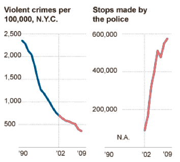
Update: This redditor said “I find it amusing that an article about misleading graphics uses a misleading graphic of its own,” when in fact, my edited graphic was not misleading, it was just wrong. Corrected now.

This is a week old, but still worth revisiting for just ‘what-the-Fourth-Amendment’ kicks: Until last week, the New York Police Department was allowed to not only stop-and-frisk just about anyone for reasons as vague as “furtive movement” , but store each friskee’s personal info in a personal database. The New York Times puts out an overlay of the NYPD’s stop-and-frisks citywide on top of a Google Map, making it easy to see how many times (mostly male minorities) were stopped on your street.

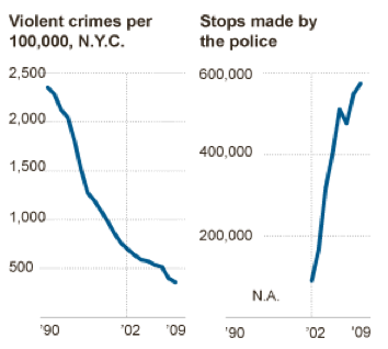
Below the fold is this interesting, awe-inspiring graphic. On the left is violent crimes per 100,000 in NYC. At the right is the number of stops made by police.

Graphic: NYT

Next to each other, just after breakfast on a Monday morning, the sharply declining and climbing graphs seem to imply that, hey, even if the stop-and-frisks are an invasion of the truly innocents’ privacy, a wedge between cops and the neighborhoods they patrol, and quite possibly, a waste of time, it does seem that crime has dropped pretty quickly, even as stops increased to nearly 600,000 in 2009.

But wait, the stops-graphic is only plotted from 2002 to 2009, whereas the violent crime rate goes back to the Giuliani era. To be fair to the NYT, they do use the same time scale, but at a glance on a graphic-busy page, it’s easy to miss that. Also, in the NYT’s favor, if you did notice the difference in plotting lengths, it really drives home the lack of correlation.

Using the stops-graphic and the related story, we estimate there were about 97,000 stops in 2002, and 580,000 stops in 2009, resulting in a nearly 600% increase in an eight year span, or about 75% a year. The violent-crime rate graphic appears to go between 700/100k in 2002, to 400/100k in 2009…which is about a 43% drop over eight-years, or roughly 5.4% per year.

And to get this amazing return-on-investment, all you have to do is sacrifice a little of the community’s goodwill towards the police, a likely consequence when stopping people for things like spitting on the sidewalk.

Other fun facts. “Furtive movement” was the reason for about 44% of the stops (“Bulge” was a reason in 9.5%).

A 40+% drop in the violent rate of crime is nothing to sneeze at, even over 8 years. In retrospect, though, it makes the NYT’s dataline choice even more justifiable: that 40 percent drop came after what looks like a 340% drop in crime over a 12 year period.

In any case, the country is, for better or worse, based on certain principles that limit police power even if stopping and frisking everyone who walks out their door could result in a drop in crime. From another story, 9 in 10 people stopped were not accused of anything.

And yet, just being stopped was reason enough to have your name and address stored into a permanent police database even, to repeat again, if you were completely innocent and just happened to be judged by the police to have “furtive movements” or a “bulge”.

Last week, though, Gov. Paterson signed a law stopping the storing of innocents’ personal info:

“There is a principle – which is compatible with the presumption of innocence, and is deeply ingrained in our sense of justice – that individuals wrongly accused of a crime should suffer neither stigma nor adverse consequences by virtue of an arrest or criminal accusation not resulting in conviction,” Mr. Paterson said.

Fries and Flavor

For your Friday reading pleasure, a 2001 Atlantic article (adapted from his “Fast Food Nation“) by Eric Schossler on Why McDonald’s Fries Taste So Good:

The taste of a french fry is largely determined by the cooking oil. For decades McDonald’s cooked its french fries in a mixture of about seven percent cottonseed oil and 93 percent beef tallow. The mixture gave the fries their unique flavor — and more saturated beef fat per ounce than a McDonald’s hamburger.

In 1990, amid a barrage of criticism over the amount of cholesterol in its fries, McDonald’s switched to pure vegetable oil. This presented the company with a challenge: how to make fries that subtly taste like beef without cooking them in beef tallow. A look at the ingredients in McDonald’s french fries suggests how the problem was solved. Toward the end of the list is a seemingly innocuous yet oddly mysterious phrase: “natural flavor.” That ingredient helps to explain not only why the fries taste so good but also why most fast food — indeed, most of the food Americans eat today — tastes the way it does.

Malcolm Gladwell of the New Yorker apparently wrote about the same subject area in 2001, concentrating more on McDonald’s attempts to make healthier versions of its food (remember the McLean? (sub-parenthetical thought: there’s far fewer Googlable articles about the McLean than I thought there would be, given its notoriety))

My favorite part of Schossler’s article is his exploration of the flavor chemical industry, by which one drop of something like methyl-2-pyridyl ketone can make a jelly-bean taste like popcorn.

Some excerpts:

A nose can detect aromas present in quantities of a few parts per trillion — an amount equivalent to about 0.000000000003 percent…The quality that people seek most of all in a food — flavor — is usually present in a quantity too infinitesimal to be measured in traditional culinary terms such as ounces or teaspoons. The chemical that provides the dominant flavor of bell pepper can be tasted in amounts as low as 0.02 parts per billion; one drop is sufficient to add flavor to five average-size swimming pools. The flavor additive usually comes next to last in a processed food’s list of ingredients and often costs less than its packaging. Soft drinks contain a larger proportion of flavor additives than most products. The flavor in a twelve-ounce can of Coke costs about half a cent.

How to make something taste like a strawberry:

A typical artificial strawberry flavor, like the kind found in a Burger King strawberry milk shake, contains the following ingredients: amyl acetate, amyl butyrate, amyl valerate, anethol, anisyl formate, benzyl acetate, benzyl isobutyrate, butyric acid, cinnamyl isobutyrate, cinnamyl valerate, cognac essential oil, diacetyl, dipropyl ketone, ethyl acetate, ethyl amyl ketone, ethyl butyrate, ethyl cinnamate, ethyl heptanoate, ethyl heptylate, ethyl lactate, ethyl methylphenylglycidate, ethyl nitrate, ethyl propionate, ethyl valerate, heliotropin, hydroxyphenyl-2-butanone (10 percent solution in alcohol), a-ionone, isobutyl anthranilate, isobutyl butyrate, lemon essential oil, maltol, 4-methylacetophenone, methyl anthranilate, methyl benzoate, methyl cinnamate, methyl heptine carbonate, methyl naphthyl ketone, methyl salicylate, mint essential oil, neroli essential oil, nerolin, neryl isobutyrate, orris butter, phenethyl alcohol, rose, rum ether, g-undecalactone, vanillin, and solvent.

The difference between natural and artificial flavors:

A natural flavor is not necessarily more healthful or purer than an artificial one. When almond flavor — benzaldehyde — is derived from natural sources, such as peach and apricot pits, it contains traces of hydrogen cyanide, a deadly poison. Benzaldehyde derived by mixing oil of clove and amyl acetate does not contain any cyanide. Nevertheless, it is legally considered an artificial flavor and sells at a much lower price. Natural and artificial flavors are now manufactured at the same chemical plants, places that few people would associate with Mother Nature.

Also, there’s a bit about how food-coloring is about as important as flavor to how humans perceive taste:

Food coloring serves many of the same decorative purposes as lipstick, eye shadow, mascara — and is often made from the same pigments. Titanium dioxide, for example, has proved to be an especially versatile mineral. It gives many processed candies, frostings, and icings their bright white color; it is a common ingredient in women’s cosmetics; and it is the pigment used in many white oil paints and house paints. At Burger King, Wendy’s, and McDonald’s coloring agents have been added to many of the soft drinks, salad dressings, cookies, condiments, chicken dishes, and sandwich buns…

Flavor researchers sometimes use colored lights to modify the influence of visual cues during taste tests. During one experiment in the early 1970s people were served an oddly tinted meal of steak and french fries that appeared normal beneath colored lights. Everyone thought the meal tasted fine until the lighting was changed. Once it became apparent that the steak was actually blue and the fries were green, some people became ill.

Mmmm…burgers….

Grainger had brought a dozen small glass bottles from the lab. After he opened each bottle, I dipped a fragrance-testing filter into it — a long white strip of paper designed to absorb aroma chemicals without producing off notes. Before placing each strip of paper in front of my nose, I closed my eyes. Then I inhaled deeply, and one food after another was conjured from the glass bottles. I smelled fresh cherries, black olives, sautéed onions, and shrimp. Grainger’s most remarkable creation took me by surprise. After closing my eyes, I suddenly smelled a grilled hamburger. The aroma was uncanny, almost miraculous — as if someone in the room were flipping burgers on a hot grill. But when I opened my eyes, I saw just a narrow strip of white paper and a flavorist with a grin.

Speaking of flavor, one of the more interesting angles I got out of the New York Times recent investigation into the food industry’s efforts to combat salt limits is how integral that compound is to making many foods taste good, from cookies to coffee. The industry argues that with less salt, they’d need better ingredients to keep a food’s flavor. Good reading if you have even more time to read about food today:

Even as it was moving from one line of defense to another, the processed food industry’s own dependence on salt deepened, interviews with company scientists show. Beyond its own taste, salt also masks bitter flavors and counters a side effect of processed food production called “warmed-over flavor,” which, the scientists said, can make meat taste like “cardboard” or “damp dog hair.”

…As a demonstration, Kellogg prepared some of its biggest sellers with most of the salt removed. The Cheez-It fell apart in surprising ways. The golden yellow hue faded. The crackers became sticky when chewed, and the mash packed onto the teeth. The taste was not merely bland but medicinal.

“I really get the bitter on that,” the company’s spokeswoman, J. Adaire Putnam, said with a wince as she watched Mr. Kepplinger struggle to swallow.

They moved on to Corn Flakes. Without salt the cereal tasted metallic. The Eggo waffles evoked stale straw. The butter flavor in the Keebler Light Buttery Crackers, which have no actual butter, simply disappeared.

Bon Appetit!

Hat-tip to Longform.org; if you haven’t bookmarked this Instapaper-friendly site, do it. It’s made my gratuitous purchase of an iPad almost worth it.

NYT: U.S. Funding Both the Afghan Government, and an Afghan Warlord Who Undermines It

An illuminating front-page story today by the Times’ Dexter Filkins, on how the U.S./NATO strategy to mesh Special Forces with the locals has led to a situation in which millions of dollars – monthly – is given to a Matiullah Khan, a warlord who fights the Taliban, yet threatens the official government that the U.S. hopes will bring stability to the region.

Khan is billed as a “lesser of two evils” and is providing security through a Taliban-thick region. But how will this strategy differ in its end-game than the short-term-gain, long-term-loss strategies we’ve used in the past to stabilize Afghanistan?

In little more than two years, Mr. Matiullah, an illiterate former highway patrol commander, has grown stronger than the government of Oruzgan Province, not only supplanting its role in providing security but usurping its other functions, his rivals say, like appointing public employees and doling out government largess. His fighters run missions with American Special Forces officers, and when Afghan officials have confronted him, he has either rebuffed them or had them removed.

“Oruzgan used to be the worst place in Afghanistan, and now it’s the safest,” Mr. Matiullah said in an interview in his compound here, where supplicants gather each day to pay homage and seek money and help. “What should we do? The officials are cowards and thieves.”

Deeper into the story, Filkins reports suspicions that Matiullah and the other U.S. backed-warlords are suspected of protecting the opium trade, and even worse, secretly boosting the Taliban so that the chaos – and thus the need for Matiullah’s services – continues:

A former senior official in the Kandahar government, who spoke on the condition of anonymity for fear of retribution by Mr. Matiullah and the Karzais, said he believed that Mr. Matiullah was facilitating the movement of drugs along the highway to Kandahar.

“I was never able to look inside those trucks, but if I had, I am fairly certain what I would have found,” he said.

Despite his relationship to the Special Forces, Mr. Matiullah has been suspected of playing a double game with the Taliban. Asked about Mr. Matiullah earlier this year, an American military officer in Kabul admitted that Mr. Matiullah was believed to have a relationship with insurgents. He spoke on the condition of anonymity because he was discussing intelligence matters.

Hopefully, this is just a phase, with the happy ending being that the shadow government set up by Matiullah is gently, but doggedly nudged with American carrots and sticks to merge with the official, legitimate one as Afghanistan stabilizes. Because we’ve learned from the last time we backed a charismatic insurgent in Afghanistan, right? Right?

David Brooks: Maybe Sandra Bullock should’ve stayed in the kitchen

So David Brooks in the NYT, using an almost-current event (Sandra Bullock winning the Oscars, then getting humiliated by hubby Jesse James) takes another (not half-bad) try at an argument that feminists might characterize as “Maybe women would be happier if they focused less on their career and more on their man and family”:

Two things happened to Sandra Bullock this month. First, she won an Academy Award for best actress. Then came the news reports claiming that her husband is an adulterous jerk. So the philosophic question of the day is: Would you take that as a deal? Would you exchange a tremendous professional triumph for a severe personal blow?

Nonetheless, if you had to take more than three seconds to think about this question, you are absolutely crazy. Marital happiness is far more important than anything else in determining personal well-being.

To be fair, Brooks doesn’t explicitly focus on wives and their role in gluing a family together, it just happens that Bullock is a woman…but it’s hard to not accuse Brooks of patriarchy when he makes this an either-or situation, as if the only two options for Sandra to choose between are “Win an Oscar” or “Have a faithful husband”…ignoring the fact that it was Jesse James who made a trade between being true to his Oscar-winning wife or bonking some tattooed-bimbo. And, completely ignoring Tiger Woods, who really did choose a world-famous career (and the attendant porn stars that come with it) over his family.

Even aside from that, Brooks’ try at the “money and power isn’t everything” philosophy opened up the conservative Brooks to a zinger, based on a more-currenter-event, from the comments:

B. Starks, Austin, TX: Mr. Brooks, great argument for ensuring health care for all and legalizing gay marriage. I imagine your conservative allies will not see it this way, but the facts noted in the column could be used to shore up both positions, and I hope they are indications you are in favor of both.

The banality of Godliness: The Vatican and Sex Scandals and a Slow Mail System

Ahhh, yeahhhh...Did you get the memo?

Ahhh, yeahhhh...Did you get the memo?

Ross Douthat, the cherubic Catholic on the NYT’s column head, tries to take a stab at his church and its recent spate of sex scandal revelations:

There has been some accountability for the abusers, but not nearly enough for the bishops who enabled them. And now the shadow of past sins threatens to engulf this papacy.

Popes do not resign. But a pope can clean house. And a pope can show contrition, on his own behalf and on behalf of an entire generation of bishops, for what was done and left undone in one of Catholicism’s darkest eras.

This is Holy Week, when the first pope, Peter, broke faith with Christ and wept for shame. There is no better time for repentance.

Douthat is rightfully taking flak from commenters for trying to blame some of the scandal on the “silly season of the ’70s”, as if disco clubs and second-wave feminism were gateways for priests to molest boys in the confessional (as one commenter points out, the moral progressivism of the 70s, which presumably weakened the Church’s influence, may have helped give victims an opening to speak out).

But if I were to be the devil’s advocate, I’d point out this passage in Douthat’s column as one to raise doubts about the holiness of the Catholic church:

There are two charges against Benedict XVI: first, that he allowed a pedophile priest to return to ministry while archbishop of Munich in 1980; and second, that as head of the Vatican’s Congregation for the Doctrine of the Faith in the 1990s, he failed to defrock a Wisconsin priest who had abused deaf children 30 years before.

The second charge seems unfair. The case was finally forwarded to the Vatican by the archbishop of Milwaukee, Rembert Weakland, more than 20 years after the last allegation of abuse.

One of the supposed upsides of having a papacy is that the Pope is presumably the supreme decider, as direct a link to God’s authority as we can have on earth. He definitively settles doctrinal and moral matters, and his words and his mind are pretty much in tune with God’s, and no one who believes in the supremacy of the Catholic Church should have any doubt otherwise.

So, basically, one of Douthat’s (and the official Vatican spokesperson’s) defenses is that, well, the man who was destined to be God’s infallible voice, didn’t stop a man (Father Murphy in Wisconsin) from molesting 200 deaf boys because the relevant memo didn’t get to him (or to the Pope at the time) soon enough.

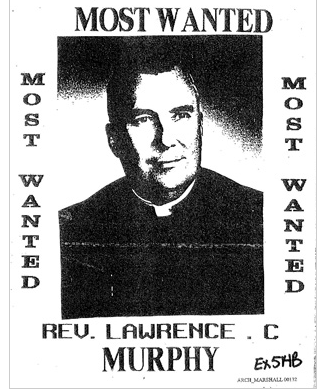
Father Lawrence Murphy, in a flyer distributed by his accusers

Father Lawrence Murphy, in a flyer distributed by his accusers


This Times interactive timeline about how Father Murphy got away is worth clicking through. Here are some of the important dates (after the last known-allegations against him):

– In Dec. 1993, Father Murphy is evaluated by the archdiocese.

– Three years later, the Milwaukee archbishop gets around to writing a letter to Ratzinger’s office.

– About half a year later, the pre-trial proceedings get held up because they’re arguing over the statute of limitations (which, according to one interpretation of canon law, is as short as 30 days).

About a year later from when the Milwaukee archbishop’s wrote a letter to Ratzinger, it finally is received by whoever is supposed to forward mail to Ratzinger’s office.

– Another year passes, and Ratzinger’s secretary recommends that Father Murphy be allowed to live the rest of his years in dignity. In the July of 1998, the Vatican sends its meeting notes to Wisconsin…and it takes about a month for them to get translated from Italian to rough English.

– In August, the Milwaukee Archdiocese puts Murphy out to pasture, promising, with almost hilarious understatement, that he plans on “strengthening the precepts that have already been placed upon Father Murphy…to assure that Father Murphy does not continue to seek contact with members of the deaf community, which often in the past has resulted in considerable dismay in the deaf community.”

– A few weeks later, Father Murphy dies. In defiance of church orders, his family gives him an open-casket funeral, with him decked out in full vestments, with invites sent out to the deaf community.

The most passionate of anti-Catholics would argue that the Church was actively covering up, and maybe even encouraging the abusive behavior of its pedophile priests. But it’s understandable how even an ardent Catholic, after reading the above-trove of documents, might conclude that the Vatican may not be covering up for predators, but it sure is dependent on an all-too human, painfully-slow bureaucracy, in which church officials spend as much time arguing over interpretation of church rules as they do criminal law and important letters are being sent over by courier in diplomatic pouches, and yet still take a year to get to the relevant official’s secretary (in another case of an abusive priest, the memo never got forwarded at all, according to the Vatican).

And even when it does reach the right official, Ratzinger in this case, there’s no guarantee that there’s enough hours in the day for him to get to it (though he did find time to punish and force a priest out of the priesthood for participating in a peace protest). If only Skype had been invented back then, maybe Father Murphy would have been punished before he was too old, as the church judged, to deserve the indignity of a trial.

I think most mature believers come to realize that, for the most part, God shouldn’t be expected to deliver miracles in quite the same immediate and dramatic fashion as depicted in the Bible. But after the case of the future Pope Ratzinger and Father Murphy, now young believers have to accept that not only will God (and his human proxy) not strike down the most evil of sinners (Matt 18:6: but whoever causes one of these little ones who believe in Me to stumble, it would be better for him to have a heavy millstone hung around his neck, and to be drowned in the depth of the sea)…He may not even make sure that the memo gets forwarded.

The other alternative is that Ratzinger (and the Pope before him) did receive and read the memos, and then did nothing. The Vatican and Douthat don’t have much wiggle room between trampling on Catholic and Christian theology, and offending basic human sensibilities.

The Foreclosure crisis, on an Arizona Street

a
Loved this story in the New York Times about the loathing, self-loathing, and helplessness in the real-estate crash, epitomized by the residents on a single Arizona street racked with foreclosures.

She said she did not feel she deserved to have her debts forgiven, but added that if her mortgage had been lowered, she would have tried harder to stay. The worst part, she said, is that her decision will hurt Mr. Setbacken, who has watched out for her over the years. “For Gary, he’s going to have to deal with the ramifications of what I’m doing because I’m bringing his property value down,” she said. “I pray at church. I feel horrible for what I’m doing to my neighbors.”

It’s easy to be angry and unsympathetic towards the homeowners who bought beyond their means and accelerated the housing crisis. But as the change of heart in one of this story’s residents argues, it’s not a practical solution and it’s not a human response.

“Unmasking Horror: Japan Confronting Gruesome War Atrocity” from the archives of the New York Times

A 1995 article by the NYT’s Nicholas Kristof, with an unforgettable, chilling lede:

ORIOKA, Japan— He is a cheerful old farmer who jokes as he serves rice cakes made by his wife, and then he switches easily to explaining what it is like to cut open a 30-year-old man who is tied naked to a bed and dissect him alive, without anesthetic.

“The fellow knew that it was over for him, and so he didn’t struggle when they led him into the room and tied him down,” recalled the 72-year-old farmer, then a medical assistant in a Japanese Army unit in China in World War II. “But when I picked up the scalpel, that’s when he began screaming.

And this dark humor:

Japan’s biological weapons program was born in the 1930’s, in part because Japanese officials were impressed that germ warfare had been banned by the Geneva Convention of 1925. If it was so awful that it had to be banned under international law, the officers reasoned, it must make a great weapon.

And the relevance today, if you believe that those who forget history are doomed to repeat it:

The research was kept secret after the end of the war in part because the United States Army granted immunity from war crimes prosecution to the doctors in exchange for their data. Japanese and American documents show that the United States helped cover up the human experimentation. Instead of putting the ringleaders on trial, it gave them stipends.