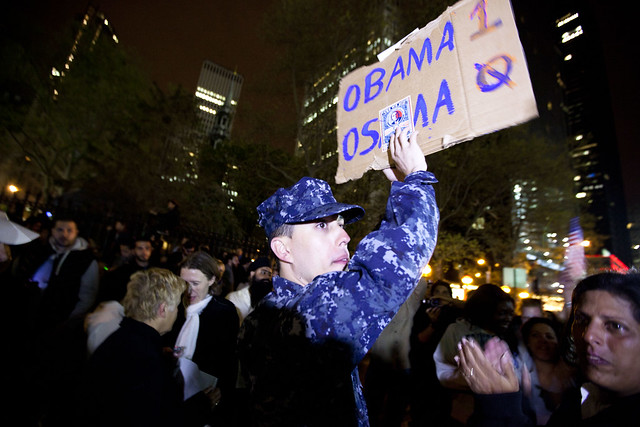
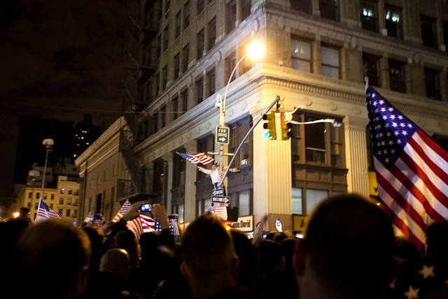
This (totally not-double-checked) analysis is a riff off of the excellent New York Times visualization (The Death of a Terrorist: A Turning Point?) of how people reacted to Osama bin Laden’s death. In the days following the news, the Times asked online readers to not only write their thoughts on bin Laden’s killing, but put a mark on a scatterplot graph that best described their reaction.
The Times used the data to show the continuum of reactions from everyone who participated. I wanted to see how reactions differed across geographical location and gender.
The Times collected about 13,000 reactions before closing it down. Besides the nature and content of reaction, users had the choice of leaving their names and geographical areas.
I used Google Refine to quickly sort out the geographic locations (which varied from zip codes, to city/state, to neighborhoods, such as “Upper East Side”). Gender was not a checkbox in the NYT’s form, so I used Refine to sort based on first names. More details in the methodology section.
Conclusion
The conclusion my totally-unscientific analysis came to: Among all NYT website users, there was general moral approval and optimism for killing bin Laden. This did not vary significantly among U.S. citizens, whether they were from the cities attacked on Sept. 11 or elsewhere.
However, non-U.S. NYT-website-users were less supportive of the action. This gap of moral approval also exists between male and female NYT-website-users and at roughly the same magnitude (about 10 points).
There wasn’t much variation in terms of how significant NYT-website-users believed OBL’s death would be. All demographic groups averaged about 60 (out of 100) in terms of how significant they rated OBL’s death in the war on terror.
In case you’re wondering: the 260 non-U.S.-female respondents averaged a 43 in positivity, which is a whole step below the average female response. U.S. females (2,270 of them), averaged a 52, compared to the 6,059 U.S. males who averaged a 65.
Data
I’ll just get right to the results tables.
The original graph was arranged so that its x-axis represented how positive users felt about OBL’s death and the y-axis represented how significant of an impact they thought it would have on the war on terror.
So, someone who thought that OBL’s demise was very good news and would have a strong impact on the war would be in the top right quadrant. Those who thought it was a bad deed, and would amount to nothing, would be in the bottom left. In the scatterplot, darker points correspond to more users with the same type of reaction.
I have two sections of tables. The first section consists of the basic numbers: The count of users, the average positivity rating (from 0 to 100) and the average significance rating.
The second section consists of visualizations. The first is a scatterplot similar to the NYT’s original graphic, with less granularity. The second and third plot positivity and significance ratings, respectively, on the x-axis, with the y-axis showing the relative popularity of each rating.
The most interesting graph is the female respondents': it was the only one in which the most-positive rating did not garner the most respondents. It appears that the most popular choice was on-the-fence.
| Group | Number | Average Positivity | Average Significance |
|---|---|---|---|
| All | 13864 | 60.23 | 61.04 |
| Males | 7067 | 64.01 | 62.07 |
| Females | 2580 | 51.81 | 60.08 |
| U.S. | 11537 | 61.28 | 61.45 |
| Outside U.S. | 1820 | 53.80 | 59.06 |
| U.S. non-NYC/DC | 9191 | 61.28 | 61.28 |
| NYC | 1978 | 61.15 | 62.18 |
| Washington DC | 368 | 62.07 | 61.74 |
Graphs
A quick note: I was not as adept as the NYT at making my scatterplot more discrete and readable. The darkness of each pixel is relative to the highest respondent count in that particular group. So, the female scatterplot looks to be denser than the others, when what probably happened was that the responses were more evenly spread out.
| Group | Scatterplot | Distribution of Positivity | Distribution of Significance |
|---|---|---|---|
| All |  |
||
| Males |  |
||
| Females |  |
||
| U.S. |  |
||
| Outside U.S. |  |
||
| U.S. non-NYC/DC |  |
||
| NYC |  |
||
| Washington DC |  |
Caveats
In my summary of conclusions section, I was careful to say “NYT-website-users.” The NYT reactions graph is not a random sampling of the population, or of even the NYT’s audience. It is a feature accessible only to web-users, which – if the Internet is still stereotypically male-dominated – might account for the high male-to-female ratio.
The reactions feature was a passive one, in that onus was on the readers to actually interact with the graphic and fill out a form. So this would seem to filter out most of the apathetic – or busy – crowd. Moreover, the NYT team removed any comments that were off-topic, trolling, or strongly inappropriate…so anyone who is driven to cuss when the topic is bin Laden has probably been filtered out.
I also think the nature of the graphic, having users pick out a point out of 10,000 (or so), might naturally have them gravitate towards the axes and midpoints. For example. someone might verbalize their reaction as “Meh, neither happy nor sad” and pick the exact midpoint, when they’re really more of a 4 or 6. Or, someone who is really happy that bin Laden is dead automatically goes for the farthest right spot because anything less than the highest positivity scale would indicate some kind of partial sympathy for bin Laden. Each scatterplot graph reflects this, with the darker spots collecting around the extremes.
And if you want to be part of the “NYT’s a bunch of liberal-brie-eaters” crowd, then it’s possible that the entire respondent base is slanted leftwards politically. I thought it would be interesting to see if results varied by red and blue states, but I think that a red-state fan of the NYT is probably not much different than a blue-state fan. And, it would’ve have taken way more time to sort out by state.
So with that said, this survey is not at all an accurate reflection of the general population, compared to a general poll. Still, it’s interesting to see that even within this select sample group, there is a large disparity between males and females, and U.S. and non-U.S. But again, we can’t really make any sweeping generalizations, such as: “Women are less positive about killing” or that “Foreigners are against American unilateral raids.” without prefacing it with “Women who use the New York Times’ website and who are opinionated enough to participate in their interactive graphic are…”
Methodology
I used Google Refine to quickly cluster around geographic locations and first names. To decide whether a user was in the U.S. or not, I used regular expressions to quickly find all the location entries with postal or AP-style state abbreviations. To filter for NYC users, I used regular expressions that looked for “NY” and rejected any that specifically stated a non-NYC city, such as Poughkeepsie. And I also just did a search for all well-known NYC neighborhoods. Finding DC was mostly just looking for “DC”
Gender was a little bit trickier. I found the easiest way was to Google for a list of the most common male and female names and do a large regular expression to filter for them. I rejected names that could belong to either gender, such as “Pat” or “Kim”. And for names that I wasn’t sure of, I just didn’t include them in the sample, so this means foreign and rare names weren’t part of the mix.
For both geography and names, I ended up rejecting most values that didn’t have a count of at least 2 or 3. So the upshot is, people with common names, like “John”, are more represented than those with relatively uncommon names, like “Leopold.”
I used RMagick to generate the scatterplots and Google Image Charts API for the bar graphs.
I’ve said it before and I’ll say it again, for geeky data analysis, Google Refine is a godsend.
A sidenote: The Jessica Dovey quote, misattributed to Martin Luther King Jr., “I will mourn the loss of thousands of precious lives, but I will not rejoice in the death of one, not even an enemy,” made an appearance 42 times in the NYT response matrix.


