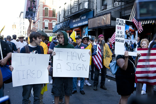
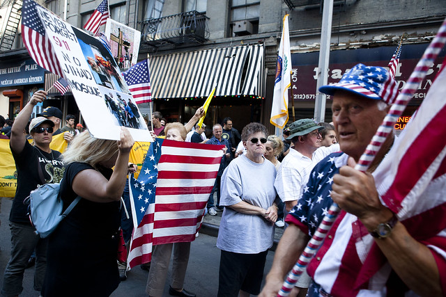
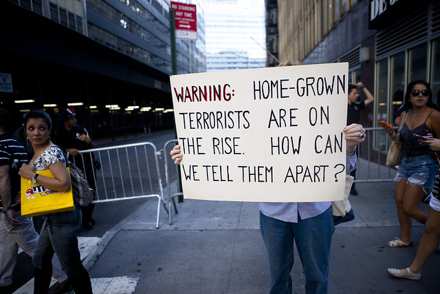
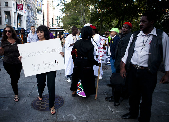
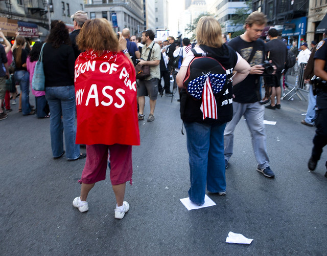
Caught the tail end of the protest against the proposed Cordoba House and mosque near Ground Zero. Some interesting signs.
Apparently, the amount of stars and stripes patternage is important to your message. This amount of flagginess is hard to argue against.
Yet, Kid Rock makes a good point here:
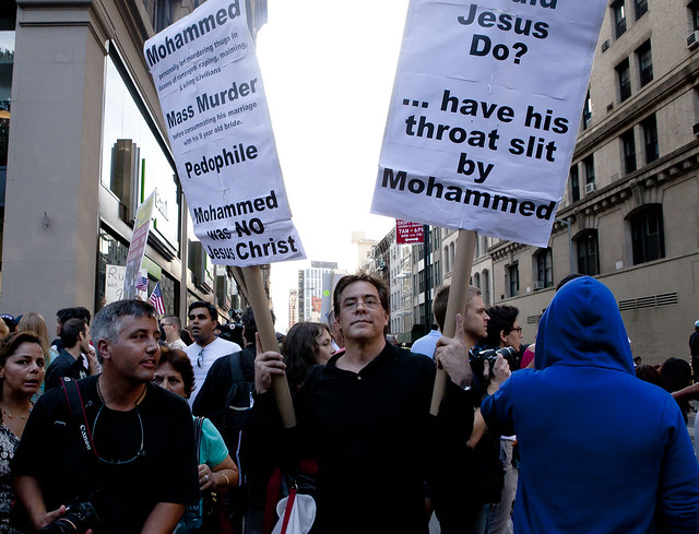
The top part of the right-sign says “What would Jesus Do?” Lose in a knife fight against Mohammed, apparently? That’s heresy in some circles.
You can tell this lady is old-fashioned by the way she added two spaces after the sentence-ending period. That’s indicative of the typewriter era and monospace fonts. Modern word processors automatically add the correct spacing.
It’s hard to see here, but the woman’s sign says “Cordoba = Conquer” and “NOT HERE!!”. Maybe her message would be more effective she put more effort and production into it than a Crayola marker. The pro-Cordoba (pro-conquest, apparently) used photos and colors to point out that “Islam has been in New York for 400 years”.
If this woman’s posterior were wider, her message (I think it said, “Religion of Peace My ASS”) would be readable. But it still works in a practical sense, as a label of which side of her body is facing you. Efficient!
