I noticed an interesting thing in Chrome Canary this morning (Chrome Canary is the bleeding edge version of the Google Chrome browser for early adopters to try out) – when you perform a search using the browser omni-addressbar, you’re taken to the standard Google search results page. However, the search bar that has been at the top of the Google results page since seemingly forever, is gone.
In the above image, the Google Canary is using the dark blue theme. Apparently, the Google designers think that if you’re savvy enough to do a search via address bar (instead of going to Google.com to do your searches), then you’ll always do it from the address bar.
The light-gray subnav bar (“Web Images Maps Shopping, etc”) is bumped up to the top of the results page. Removing the search bar (and button) adds a good 30 pixels for more search result real estate. Here’s what 30 pixels looks like on a 500 pixel-high browser window:
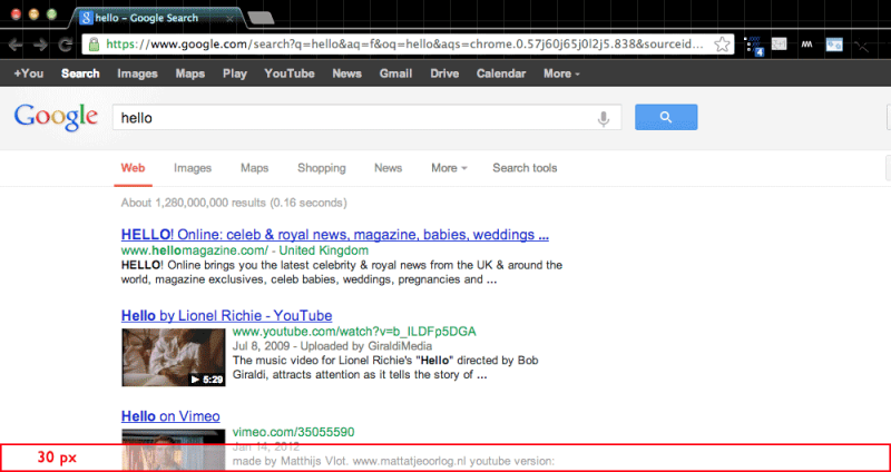
What 30 pixels looks like on a Google Search results page
(note: The black-bar top-nav is also removed in Chrome Canary, though I’m not sure if that’s the result of a different UX decision. That also frees up more screen space)
It’s a sensible design choice; for all I know, this change could’ve been enacted a year ago and I probably wouldn’t have noticed. The search bar as-part-of-the-browser-app is a design pattern that’s only become more entrenched with how search is done on native apps (on Google and on any other service that has full text search), where the search is accessed through a fixed widget or special button. Perhaps this will increase the rate of click throughs for Google search results that aren’t among the top two returned, now that there’s a little more real estate? It may seem like a sliver, but slivers can matter: Google’s and Amazon’s tests famously showed that imperceptible delays would have a significant negative effect on user engagement: in Amazon’s case, every 100ms cut sales on a given page as much as 1%.
Note: at the time of this post, Google Chrome was at version 26.0.1410.43. Canary is at 27.0.1454.0.
Update: Just noticed that Google Operating System (an unofficial blog) covered this issue last week. In his March 16 post, Alex Chitu has these complaints:
Closely integrating Chrome with Google Search breaks a lot of things. For example, you can’t edit the URL to tweak some parameters, the “I’m feeling lucky” feature is no longer available and the omnibox doesn’t include visual spell checking, enhanced suggestions and probably other features.
I think all of these complaints are likely seen as minor:
1. I bet Google’s A/B testing shows that a very negligible part of their user base tries to manually tweak the URL parameters. Hell, I don’t even do that and I’m a developer. When teaching data journalists how to navigate government websites by futzing with the params (which are much more straightforward than Google’s), I’ve found that many of them are amazed that you can even do that. I’m guessing that is very much the same for most Google users in general.
2. Spellcheck is not needed for Google searches. Google spends a significant amount of resources and academic talent to get past user input errors. In fact, Google probably wants to train users *not* to spellcheck their queries, as it slows down the search time (from the user’s perspective). Better to have Google bend over backwards for the user, I suppose.
3. “I’m feeling lucky” is more or less unneeded with how Google has refined its search experience. And it doesn’t seem like a much used feature anyway, though it is a cool quirk.
The bigger picture, though, is that greater visibility for the third or fourth search result is likely to be something that benefits all Google search users than the features listed above.
