Author Archives: Dan

Waiting in line for the MoMA’s Rain Room: Some datapoints and pointers

Update (7/24/2013) – Confirmed: you will likely never get to see the Rain Room in New York if you haven’t seen it yet. See the table below to see the latest wait times.

Summary I saw the rain room MoMA exhibit. If you are thinking of visiting it, too, be prepared for a long wait, even as a member. Jump to my compiled historical list of approximate wait times.

I finally saw the much-talked about Rain Room – by the art + design + engineering group, rAndom International – at the MoMA this Saturday, and all it took was waking up at around 5:30AM on a Saturday to get in the members-only line at 6:30AM, which is 3 hours before the “members only preview” actually opens. I was first in line, and about 15 minutes later, a couple joined me. They were members too, despite only visiting New York for the weekend, because they had bought memberships just to see the Rain Room. In addition, they also had the (correct) foresight to arrive extremely early, because (non-bribery) money alone was not enough to guarantee a reasonable wait, as the line grew pretty quickly even at 7AM.

If you don’t care for my admittedly lame anecdotal experience, here’s a crowdsourced table of wait times, by date, day of the week, and membership type, according to the MoMA’s Twitter account, a Twitter search for “#rainroom hours”, and other bloggers.

Wait in hours Date Day Arrival time Line type
9 July 23 Tuesday 9:10AM Members
(Capacity reached) July 22 Monday 2:30PM Both
(Capacity reached) July 14 Sunday 9:00AM Both
4.5 July 12 Friday 2:00PM Members
6.5 July 12 Friday 2:00PM Non-Members
1.75 July 8 Monday 9:30am Members
4.5 July 7 Sunday 9:24am Members
7.5 July 7 Sunday 9:24am Non-members
3 July 6 (me) Saturday 6:30am Members
7 July 5 Friday 10:15am Non-members
4 July 5 Friday 8:30am Members
6 June 29 Saturday 11:39am Non-members
4.5 June 29 Saturday 11:39am Members
7 to 8 June 28 Friday 11:40am Non-members
3.5 June 16 Sunday 1:30pm Non-members
4.5 June 14 Friday 12:31pm Non-members
3.5 June 14 Friday 12:31pm Members
3 June 7 Friday 8:30am Non-members
5 May 22 Wednesday 10:30am Non-members
3 May 20 Monday 2:16PM Non-members
1 May 20 Monday 2:16PM Members
6 May 18 Saturday 10:48AM Non-members
4 May 18 Saturday 10:48AM Members
5 May 18 Saturday 10:30am Non-members
3 May ?? ?? 9:30am Non-members
1.5 May 14 Tuesday 11:38am Non-members
0.5 May 14 Tuesday 11:38am Members

Was it worth it? Well, if you’ve heard and seen what the exhibit is about, don’t expect to experience many startling epiphanies beyond what you can already anticipate (unless you’ve never been around falling water and/or used an umbrella). One of the reasons why the exhibit has such long lines is that it can only accommodate about 10 people at once. More importantly, by mandate of the artists, rAndom International, every visitor is allowed to stay as long as they want so that they can experience the exhibit on their own terms.

However, the MoMA politely urges you to keep your visit at 10 minutes. That was enough for me, even after building up the assholish-level of self-entitlement that comes naturally with waiting in line on Saturdays. Like I said, the Rain Room is what it’s been advertised as: it’s a big dark room where it rains around but not on you. It’s neat in a way that my terrible writing doesn’t quite fully capture, and its core experience stands on its own without eliciting the sneaking suspicion that it’s one of those high brow performance artworks in which the actual artistic value is in how many people it fooled into standing in line for an otherwise mundane experience. But I think I was able to get the full gist of it after 10 minutes…or maybe I just felt guilty about everyone waiting outside in the hot sun.

If you just want to see the exhibit, that is, to stand in the room and watch the people who’ve waited for hours to walk under the rain, there’s a separate, much faster line (a wait of minutes, not hours) for that. But not being under the rainy section kind of misses the point…

The exhibit closes on July 28, about 3 weeks from now, so I imagine lines are just going to get longer.

Note: For the rest of the summer, the MoMA is open until 8PM on Thursdays and Fridays, which gives you a few more hours of accessible time.
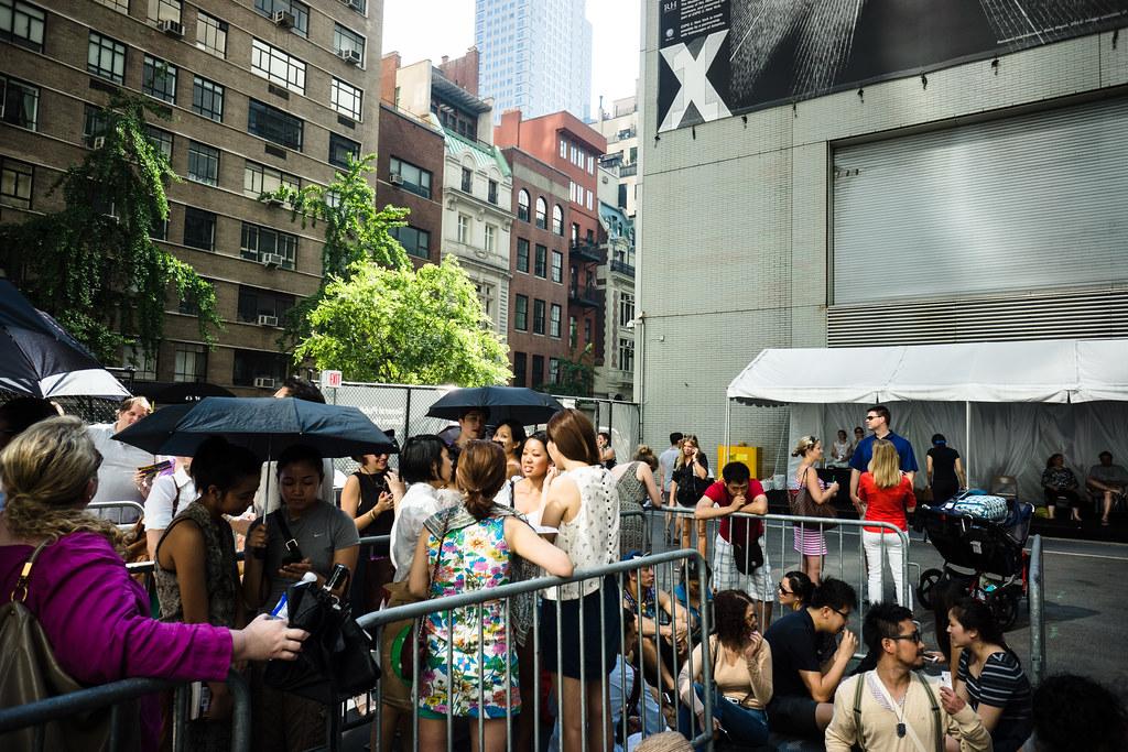
Getting in line

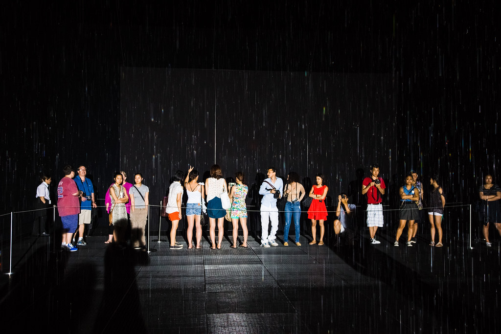
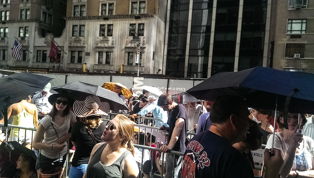
This was the line on 54th street at around 7AM, two hours before the exhibit opens (note: bring something to read):

Waiting for the MoMA's Rain Room

I had tried to see the Rain Room the day before and naively thought that showing up at 8:30am with my membership card (members are allowed in at 9:30; general admission starts at 10:30) would be more than enough preparation. And this was the Fourth of July weekend, when you’d expect most of the MoMA members to have left town, leaving me at the head of the line of non-member tourists. Nope. The members-only line stretched down the block and the wait was at least 4 hours in 90-degree weather. While I was there, I overheard a staff member saying that waiting times had been as long as 9 hours (but I didn’t hear what day or time that was for).

So getting in line at 6:30am on Saturday for a 3-hour wait before the day got hot is actually the sane thing to do.

Other data points

The actual wait time varies by day and time. On July 4, the MoMA tweeted it was 4 hours for members, 5 hours for non-members (just in case you worried you’d miss the fireworks).
Back in June, the MoMA said the line typically reached capacity at 3PM, when the average wait was just 2-3 hours for members. A staff member told me that they’ve now cut the line as early as 1:30PM and that in the Rain Room’s debut in London, the exhibit’s lines would reach capacity even before the exhibit opened.

Update: On July 17, the New York Times noted that on the previous Sunday, the line was shut down at 9 AM (i.e. a half-hour before the exhibit actually opened)

Note: The queues in London were reportedly as long as 12 hours

Blogger Usha Joy wrote about her experience in the general admission line on Saturday, May 18. She said the wait was 5 hours: with just 20 people in front of her in the non-members line, she had to wait two hours to get put into the back of the entrance line, and then from there, 3 more hours to actually enter the exhibit. Now that it’s July, I imagine the time delay is a bit longer.

In late June, the MoMA tweeted that a mistaken blogger had fooled people into thinking that June 28 was the last day, leading to waits of 7 to 8 hours. At that time, the MoMA’s Twitter account also said member waits could be as short as 2 hours, and that Tuesdays were best.

To see a list of dates and purported wait times, here’s a link to the table above.

Line for the MoMA's Rain Room

At about 8:15 they let the line move into the fenced holding area, because it’s already long enough to go down to 6th Avenue (interestingly, the non-members line was still almost empty at this point). If you’re a member bringing in a non-member friend, you can purchase admission tickets for your coattail-riding friend inside the fenced area. Actually, everyone can buy tickets at the tent inside, so maybe you should wait on purchasing tickets until you’ve made it through the gauntlet. According to Usha Joy, the wait inside the fenced area is about 3 hours.

They also sell snow cones, too.

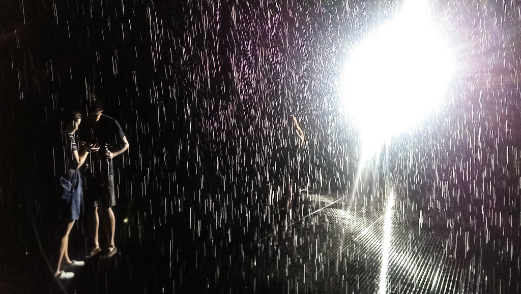
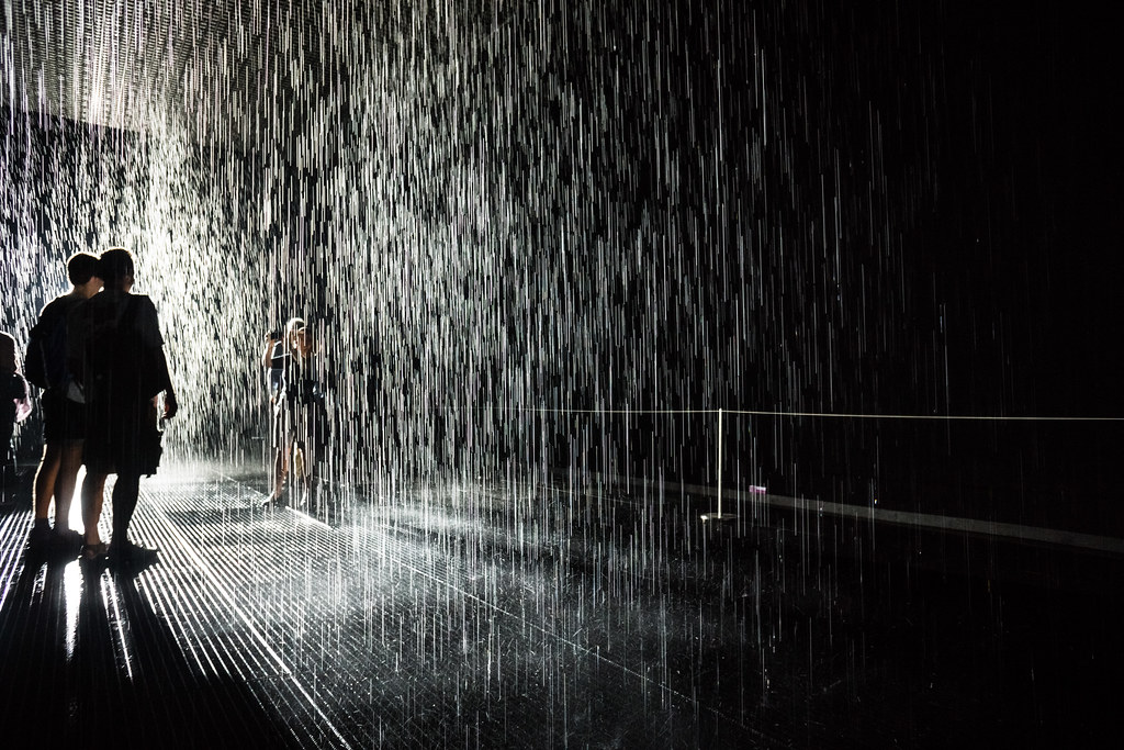
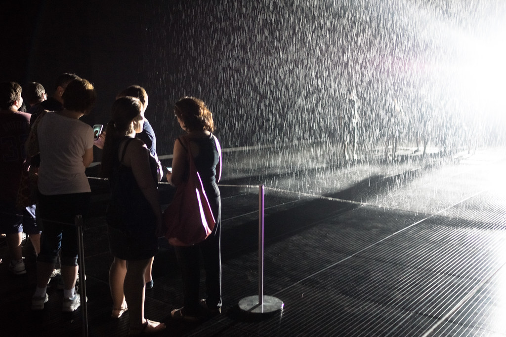
At 9:30, we were let in. Whee. Well, I was the first in line so this is what the Rain Room looks like before anyone else is inside:

MoMA's Rain Room; first one in

Here’s some video I took entering the rainy part of the room. In the last part of it, you can see how the room is divided into the “interactive” area and a viewing/waiting area:

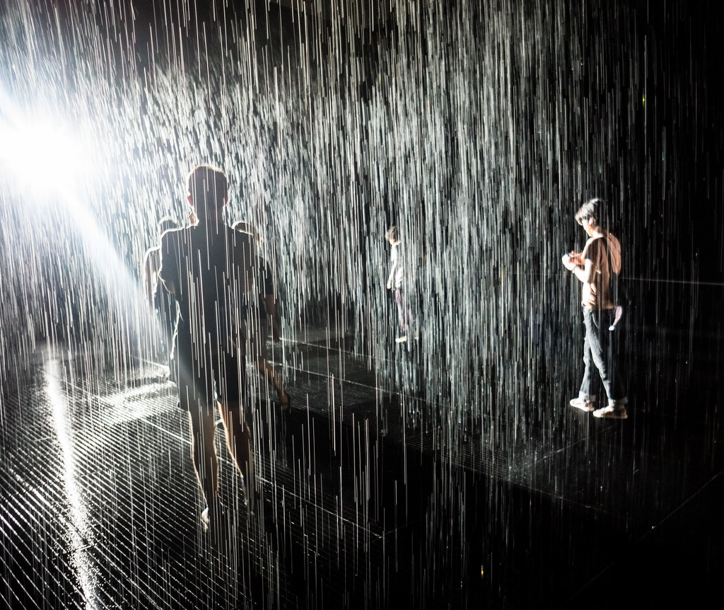
There’s plenty of space for people to move around and have their own little personal un-rained spot:

MoMA's Rain Room

The exhibit has some room on the side for people who just want to view the wet fun:

MoMA's Rain Room

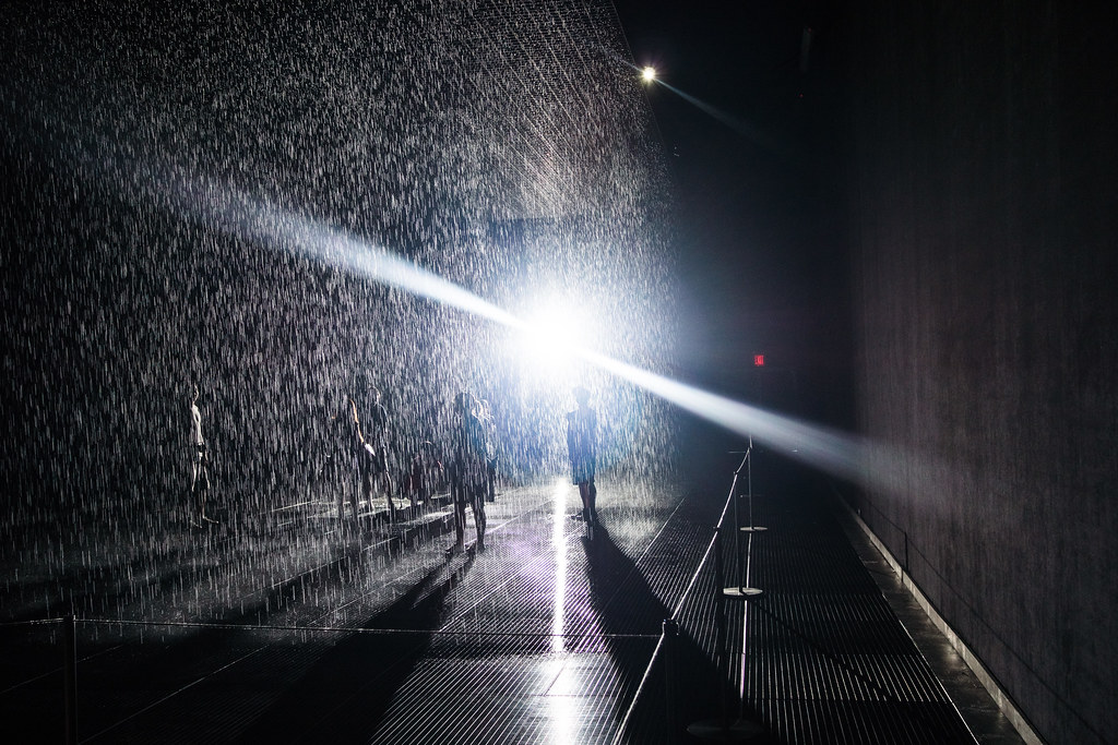
Here’s a short clip of me looking up at the ceiling without water getting all over my camera. You can see where the sprinklers are turned off, presumably because people are right under them.

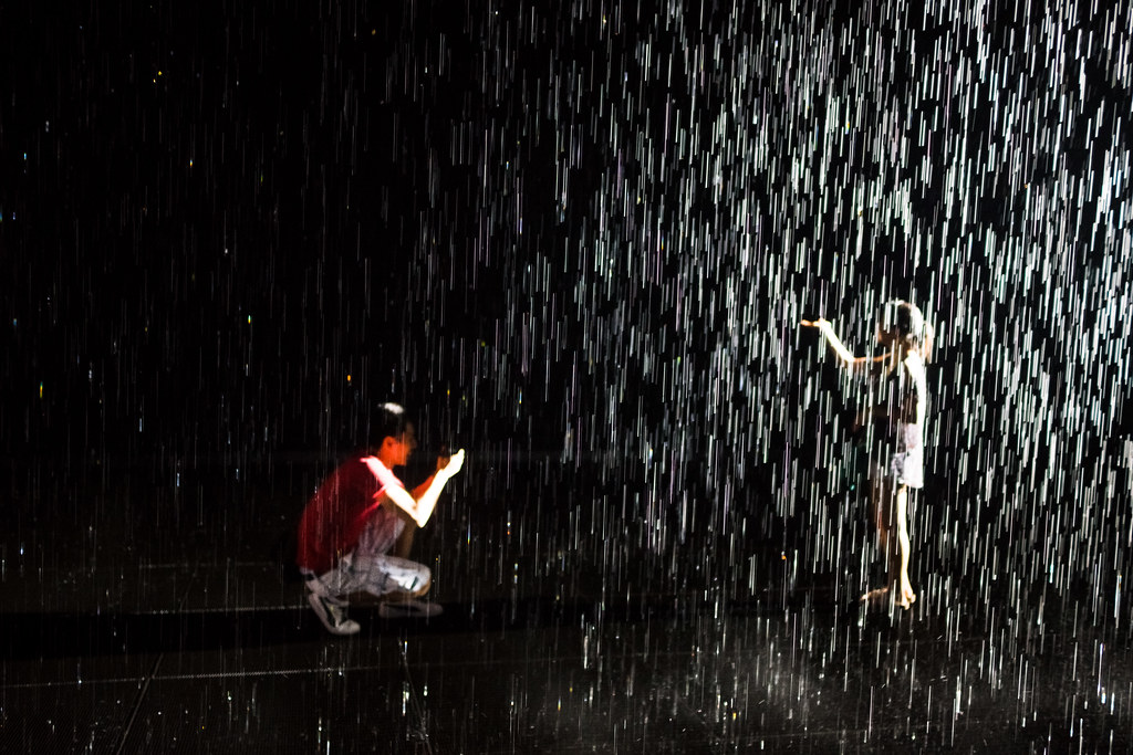
Unlike some special exhibits, the MoMA encourages you to take photos, so feel free to satisfy your Instagramming needs. It’s mostly safe to take your DSLR camera in. If you stand still, water shouldn’t fall on you, though the exhibit’s sensors may fail to track your movement once in awhile. I got doused but I was able to change lenses while standing still.

Posing in the MoMA's Rain Room

MoMA's Rain Room

MoMA's Rain Room

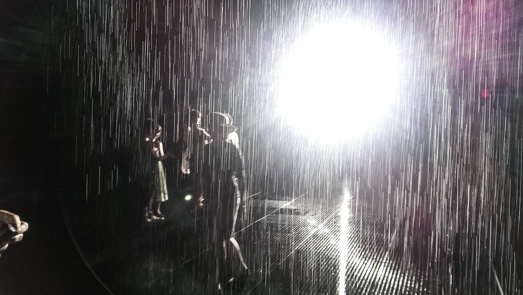
The photos and video above were taken with my DSLR. But you can get decent shots with a camera phone if you expose correctly. This is a photo from what my camera phone:

MoMA's Rain Room

While 10 people get to actually run around in the virtual rain, 20 others are on deck, worrying that the water will run out just before they get their chance to enter.

Waiting for the MoMA's Rain Room


MoMA's Rain Room

So that’s the Rain Room. Pretty novel experience but whether it’s worth the wait is up to you. For me, 3 hours not in 90-degree weather is a decent tradeoff. Nine hours? I’d say, no. The exhibit closes on July 28, so there’s probably going to be a growing rush/panic to see it over the next few weekends.

In summary: prepare to give up a workday or a very early morning to see the Rain Room. Is the Rain Room worth hours of your working/resting life? Is any art worth that? Once you’ve convinced yourself of the affirmative to that perpetual life question, the second question to answer affirmatively is: do I own a lightweight, opaque umbrella?

I initially thought that people who had brought umbrellas while waiting in line for the Rain Room were people who hadn’t read the description of the Rain Room and/or the day’s weather report. But actually, they were smart enough to realize that there’s not much shade on 54th Street. The MoMA does have a few spare umbrellas for those near the front of the line…but don’t go without your own. It’s a long time to stand outside, rain or shine.

Line for the MoMA's Rain Room

Waking up at the crack of dawn seems excessive, but 3 to 4 hours of when you can just sit/nap in one spot seems way more preferable to standing around in midday heat, waiting for the line to crawl forward. Because the exhibit area is so small, even just a few people can make a big difference in wait. Think about it: 10 people at a time means that only about 60 go through in an hour, and that’s only if they all abide by the MoMA’s courtesy rule of a 10 minute visit (are people more likely to overstay their time in the Rain Room the longer they had to wait in line?…) Hopefully the MoMA does something like the Met did with the Alexander McQueen exhibit in 2011 and extends the hours and/or exhibition period.

And there’s the issue of price. Standard entry to the MoMA is $25. I guess if you get into the Rain Room early enough that you can enjoy a few hours at the museum, it’s worth the money. Let’s say your life’s goal was to see the Rain Room, then even a membership just to see it may be rational: If the average difference in wait between members and non-members is 3 hours, then ($85 – $25) / 3 is “only” $20 per miserable hour of waiting.

While I couldn’t justify paying a one-time cost of $25 and waiting for 5+ hours for just about anything, including the Rain Room, I’ve been a member at the MoMA for awhile. And at the risk of sounding like a shill for them, the membership is a decent deal if you live in the city. The MoMA lacks a pay-whatever-you-want policy (as at the Met), so the membership is worth it if you have frequent visitors, because guests of members get in for $5 apiece (i.e. befriend a member before seeing the Rain Room). I’ve even paid for the Film membership for the special movie events at the MoMA’s theater, the best of which by far was the premiere of Jackass 3D, with Johnny Knoxville and his co-stars onstage afterwards to discuss the artistic impact of being hit in the balls while hitting each other in the balls with their microphones. If I’ve made the Rain Room out to be anti-climatic, it’s only relative to the unrealistic heights of cultural sophistication to which I have been acclimated.

Some more helpful reading material about the Rain Room from The Smithsonian, The Australian Design Review and Gizmodo.

The New York Times called the Rain Room “little more than a gimmicky diversion” and followed up with an article about the exhibit’s popularity.

(You can see all my photos at my Flickr account)

2,000,000 pageviews on Flickr…I think?

After about three and a half years since I registered for Flickr Pro, I’ve hit the 2,000,000 photo-views milestone.

I had expected to hit that mark tomorrow, because of two trending photos I submitted to Reddit’s r/nyc and r/CityPorn subreddits. However, it’s a little strange because I shot past the 2M mark because this photo of an informal Pride parade received more than 19,000 page views in a matter of seconds:

Flickr stats

Flickr stats

If you look at the stats pic above, you’ll see that nearly all of the photoviews come from “Unknown Source”…Nome of my photos have ever reached that many pageviews in so short a time, so I’m guessing someone’s Reddit/Tumblr scraper went bonkers.

I expected this photo of the New York skyline from NYU’s Kimmel Center to be the photo that racked up the thousands of pageviews, but I suppose it’s proper timing that a Pride-related photo would have the honors.

NYC's Washington Square Park, Fifth Avenue, and Empire State Building from NYU's Kimmel Center

NYC’s Washington Square Park, Fifth Avenue, and Empire State Building from NYU’s Kimmel Center

Engineering and A-holes

I’ve been a huge fan of pop science author Mary Roach’s work ever since “Stiff: The Curious Lives of Human Cadavers“, her entertaining book on how we use and dispose of corpses. Her latest book, Gulp: Adventures on the Alimentary Canal (non-affilate link here), is a similar quirky but informative work that focuses on the human digestive system, from the point at which food lands on your tongue to the long trip it takes to the toilet.

Her inspiration for this topic? The “gross” process of digestion has, in Roach’s opinion, relegated it to obscurity:

Feeding, and even more so its unsavory correlates, are as much taboos as mating and death. The taboos have worked in my favor. The alimentary recesses hide a lode of unusual stories, mostly unmined. Authors have profiled the brain, the heart, the eyes, the skin, the penis and the female geography, even the hair, but never the gut. The pie hole and the feed chute are mine. Like a bite of something yummy, you will begin at one end and make your way to the other.

The book appeals to a broad audience, but I think the engineer in me especially appreciates Roach’s curiosity. Eating…and everything that happens after it…is such a routine, mundane, yet hidden and essential process that we don’t perceive it as being complex or interesting, just as we generally ignore the amazingly complex sewage systems that make our cities livable. The best engineered works almost always involve details and logistics we don’t care to think about.

An example from Roach’s book: the flammability of farts. Though great material for YouTube today, this was apparently a serious concern in space exploration. In NASA’s early days, Roach writes, they were so worried about the build-up of human gas in the sealed space capsules that it was suggested that astronauts should be selected only from “that part of our population producing little or no methane or hydrogen.”

Roach’s book covers more than the waste-part of human eating, but I think her most memorable passages come at the end. First, here’s an engineering joke that seems to be told to every incoming freshman engineering class:

An electrical, a mechanical and a civil engineer all sat down one day to try and decide of which of their faculties god must be to design the human body.

The electrical engineer says god must be an electrical engineer, for you only have to look at the complex nervous system powered be electrical impulses.

The mechanical engineer was sure that god must be a mechanical engineer, for the advanced mechanical systems, the heart a pump, the veins pipes and the tendons and muscles an advanced pulley system.

Finally after hearing the civil engineers arguments, both the mechanical and electrical engineer both agreed that god must be a civil engineer, for who else would run a sewer system through a recreational area!

The joke is meant at the expense civy engineer’s lack of aesthetics, but author Mary Roach presents an amusing rebuttal, of sorts; it’s not careless planning, but a bonafide miracle of engineering:

Any discussion of the sexuality of the digestive tract must inevitably touch on the anus. Anal tissue is among the most densely enervated on the human body. It has to be. It requires a lot of information to do its job. The anus has to be able to tell what’s knocking at its door: Is it solid, liquid, or gas? And then selectively release either all of it or one part of it. The consequences of a misread are dire. As Mike Jones put it, “You don’t want to choose poorly.”

People who understand anatomy are often cowed by the feats of the lowly anus. “Think of it,” said Robert Rosenbluth, a physician whose acquaintance I made at the start of this book. “No engineer could design something as multifunctional and fine-tuned as an anus.”

“To call someone an asshole is really bragging him up.”

-via Roach, Mary: Gulp: Adventures on the Alimentary Canal (pp. 216-217). W. W. Norton & Company. Kindle Edition.

Flickr’s redesign makes it a photo service actually worth sharing

I’ve been a paying Flickr member since late 2009, but this year was going to be my last. I believed this even after I forgot to change my billing settings and Flickr auto-renewed me into 2015, because it seemed chances were good that Flickr, a long-neglected and resource intensive property, would get the ax soon and I’d get a refund anyway.

Flickr’s been a great place to organize and store photos, but its outdated, lackluster design – mostly unchanged for nearly a half decade – made it unappealing for actually viewing photos. In addition to paying the annual $24.95 fee for Flickr’s pro membership, I bought third-party iOS apps just to browse my own Flickr collection. So leaving Flickr would’ve been inconvenient, but only in the way that having to move my dusty box of photos from one attic to another would be inconvenient.

So, of course, I was one of the jaded naysayers who, after hearing Tumblr was bought by Yahoo for $1.1 billion, thought:

  1. Hello Tumblr, welcome to retirement
  2. Goodbye Flickr, that’s $1 billion that won’t be going to your modernization

But Yahoo’s (quite abrupt) launch of a “better, brighter” redesign will keep me a happy member for at least the next couple of years. For the first time in about 4 years of being a paid member, I’ll actually want to use Flickr to show my photos.

Before this week’s redesign, Flickr’s sparse, thumbnail-heavy design – which may have been sensible five years ago, when bandwidth was more expensive – made the service unappealing for easy browsing of images. Here’s what my profile page looked like in April (courtesy of web.archive.org, which apparently captured it in French) compared to post-redesign:

full sizes

Note: Flickr’s JavaScript hides the photos that are outside the browser’s current viewing area, which is why you see all those gray boxes at the bottom.

If you haven’t been actively using Flickr (and based on ongoing reports of Flickr’s demise, this is likely the case), Flickr’s redesign may seem like just catch-up to the photo-heavy designs long adopted by Google+ and, well, Tumblr. But it was an absolutely critical improvement for Flickr. Flickr has had more than enough features for managing and discussing photos (compared to non-photo-centric services), so the fact that the redesign is mostly a skin-deep overhaul is just fine (for now).

This seems almost too obvious to state, but the appeal of photography is rooted in the immediacy and attractiveness of its visual display. A wedding photographer told me that the key to his success was that he took the time to create a printed book of photos for his clients instead of just handing them a photo DVD. Because while photo DVDs hold many more photos, having to pop in the DVD and browse photo files with the computer’s default photo program was a terrible viewing experience. And so clients rarely browsed photo DVDs for leisure. And more importantly, to the photographer dependent on referrals, customers rarely showed the DVD photos to visiting friends and family.

The Flickr “photostream” now actually looks and navigates like a photostream. There’s a few JavaScript issues and performance kinks to work out, but I can’t overstate how much more nicer the redesign is, and I wonder how much Yahoo! CEO Marissa Mayer had to do with pushing it through. When she was a vice president at Google, Mayer was well-aware of how sensitive users are to speed – a half-second delay in retrieving search results resulted in a 20% drop in revenue and traffic from users. I imagine this sensitivity is even more acute when it comes to visual streams, in which we expect to experience images as fast as the light hits our retinas. In 2010, Mayer took some good-natured ribbing about how stingy Google’s (text) search results were. While she didn’t go into the justification behind Google’s only-10-links-per-page design, she spoke proudly of a new infinite scroll feature in Google Image Search, which allowed users to scroll thousands of images quickly.

“People are able to scan lots of visual information, really fast,” Mayer said. “[But] reading a search result may take longer.”

The redesign improves Flickr’s viability as a social network, too. Even though Flickr had one of the earliest photo communities and discussion groups, the homepage did very little to surface those interactions. Instead, the default user homepage put priority on showing users their own most recently uploaded photos, which, if you hadn’t uploaded photos in weeks or months, was not a good use of the homepage. There were subsections for the photos uploaded by your groups and friends, but again, the thumbnail-focused design made this unusable. I almost never clicked through the thumbnails of other people’s photos because it was impossible to know from 75×75 pixels if the photo was worth looking at.

Here’s what the Flickr homepage looked like for nearly five years after the 2008 redesign, (courtesy of CNET):

Via a CNET review

Here’s what logged-in users see on the Flickr homepage today:

The Flickr homepage today, for a logged in user

Right now, it seems that Flickr is just showing the most recent photos from my network, without curating them with data metrics (such as number of views, favorites, comments) to ensure that the photo is also interesting. But I’m already more interested in my network than I’ve ever been.


When Flickr introduced its new mobile app late last year, that actually bolstered my opinion that the service was in its final year, because the new app seemed like the very epitome of a hasty ohmygod-lets-just-do-something plan: “maybe if we add filters, users will come back to us.” But this week’s changes give some assurance that someone in charge really cares about making Flickr relevant again. The photo-centric design and the (practically) limitless storage space are absolutely critical to the way people use photo services. Flickr’s previous limit of 200 photos for non-pro users was made Flickr completely useless in a technological era where the average smartphone user produces 200 (relatively) likeable photos in a couple of weeks.

And the redesign makes Flickr a real home for photos, not just a storage box. For awhile, I’ve half-assedly maintained a set of my “favorite” photos, about 500 of the 8,500 I’ve dumped on Flickr so far. My favorites set wasn’t a place to show off (the album design was as plain as the old photostream design), but merely triage for my photo archive before I finally got around to quitting Flickr to move to an attractive portfolio site. But with the new design, my photoset pages are just about good enough to be portfolio pages:

Part of my "favorites" set

Part of my “favorites” set

To give you an idea of how little I navigated my own Flickr collections – i.e how important the interface is to the photo browsing experience – my first thought when looking through my set of favorites after the redesign wasn’t, “These photos look nice,” but: “Wow, I don’t even remember taking some of these photos.”

Even though the Tumblr acquisition is the big news this week, kudos to the Flickr team for their own big changes and their big ambitions.

Writing advice: Keep the bear, and just the bear

John McPhee has been writing for about 50 years now, which, even if you ignore his four Pulitzer finalist awards (and one win), is a good deal of writing experience. But getting past writer’s block hasn’t gotten any easier for him.

McPhee wrote about overcoming writer’s block in the Apr. 29, 2013 New Yorker: “Draft No. 4; Replacing the words in boxes”. The full article is behind a paywall, but the excerpted opening includes a great bit of advice for a former student named “Joel”:

Block. It puts some writers down for months. It puts some writers down for life. A not always brief or minor form of it mutes all writers from the outset of every day…

You are writing, say, about a grizzly bear. No words are forthcoming. For six, seven, ten hours no words have been forthcoming. You are blocked, frustrated, in despair. You are nowhere, and that’s where you’ve been getting. What do you do?

You write, “Dear Mother.” And then you tell your mother about the block, the frustration, the ineptitude, the despair. You insist that you are not cut out to do this kind of work. You whine. You whimper. You outline your problem, and you mention that the bear has a fifty-five-inch waist and a neck more than thirty inches around but could run nose-to-nose with Secretariat. You say the bear prefers to lie down and rest. The bear rests fourteen hours a day. And you go on like that as long as you can.

And then you go back and delete the “Dear Mother” and all the whimpering and whining, and just keep the bear.

The rest of the McPhee’s piece is a mine of writing wisdom. He goes on at length about how you must just write anything: “The way to do a piece of writing is three of four times over, never once,” McPhee advises another student. “Blurt out, heave out, babble out something — anything — as a first draft…Until it exists, writing has not really begun”

And a truism worth mentioning, and something that I’ve found applies equally to photography and programming: “The difference between a common writer and an improvisor on a stage is that writing can be revised. Actually, the essence of the process is revision.”

McPhee’s piece reminded me of writing advice from C.S. Lewis to a young fan. Each point in Lewis’s list is excellent advice, but this is my favorite:

In writing. Don’t use adjectives which merely tell us how you want us to feel about the thing you are describing. I mean, instead of telling us a thing was “terrible,” describe it so that we’ll be terrified. Don’t say it was “delightful”; make us say “delightful” when we’ve read the description. You see, all those words (horrifying, wonderful, hideous, exquisite) are only like saying to your readers, “Please will you do my job for me.”

I’ve seen it with non-professional writers including myself: going on a thesaurus hunt for an adjective to fill space when nothing would do just fine. What makes this particularly pernicious is that you never realize how much time you’re wasting on synonyms and, to top it off, the synonym will end up polluting your writing.

I imagine McPhee agrees. In his “bear” example, he doesn’t use a single adjective to describe the bear. He just lists its concrete dimensions.

First drafts, not coincidentally, come a lot faster when you skip the adjectives.

The Great Gatsby in 3D at the MoMA

Last night I went to the MoMA’s screening of Baz Luhrmann’s “The Great Gatsby” . Following the story’s theme of spectacle, it was appropriate that way too many people showed up (it was Film members only) and had to be turned away. I heard a man muttering to his wife, “Someone should be fired for this!” and I had to initially sit on the floor in the overbooked theater.

Today the MoMA’s membership director sent out an apologetic email:

I was dismayed to learn that last night’s MoMA Film Plus screening of The Great Gatsby was overbooked, and that as a result, a number of our Film Plus members were unable to see the film. It is extremely important to me – and to all of us at MoMA – that members have the best possible experience with the Museum. I am deeply sorry for the inconvenience and frustration this must have caused. Please let us know by reply email if you were one of the members shut out of the screening. I would very much like to apologize directly to those who were affected.

I have to admit, if the promise was: “Please email me and we’ll invite you to a second screening of the movie”, I might have lied to see the movie again…it was pretty good, even from the very back rows. Definitely the most appropriate use of 3D I’ve seen yet, and that includes Avatar, but only because Avatar was a terrible movie. Luhrmann’s “Gatsby” had the advantage of Fitzgereald’s story and after watching his vision, it’s hard to imagine anyone else doing it as well (especially when you consider how awful the Robert Redford version was). Even if you don’t like Luhrmann’s over-the-top style, there’s really no better way to do “Gatsby” than being completely over-the-top. And the 3D just complemented the theme of excessive indulgent bullshit, rather than just being a movie-going gimmick.

The movie’s first half was great, the second half couldn’t keep the pace. And disappointingly, some of the memorable character details that I’ve always liked in “Gatsby” — such as Jordan being a total sneak, her relationship with Nick, and Meyer Wolfsheim’s last scene with nick — weren’t in the movie.

Whatever the movie’s faults, what Luhrmann cemented for me is the timeless quality of “The Great Gatsby.” It helps that the story takes place during the “Jazz Age,” one the most progressive and interracially-related period before the Civil Rights Movement. But during the whole movie, I kept thinking how virtually nothing in the depiction of decadent life is alien to what we think of today, and in the movie, the use of Jay-Z and Beyonce in the soundtrack is much less anachronistic than you might think. In fact, the only think that reminded me that “Gatsby” takes place in the past is that none of Gatsby’s party goers were Instagramming/twittering the entire time.

I was surprised when Louis C.K. listed “The Great Gatsby” as his favorite book when the Times interviewed him last month (Louis mocked the fact that the 3D movie was being produced)…It’s my favorite book, too, but I only thought that because I was a high school book nerd. After seeing Luhrmann’s interpretation, I think it’s fair to say that “The Great Gatsby” is a story just as universal as any of Shakespeare’s works. Luhrmann’s version could’ve been better, but the spectacle is worth watching. And it’s hard to beat the “The Wire’s” depiction of “Gatsby” (I think it was a poor choice for Luhrmann not to include the book scene in his movie):

SummerStage 2013 App: SummerStageLove, formerly SummerStageHand.com

Edit: Just kidding, I decided to go for a less lamey sounding name: say hello to SummerStageLove.com. The HackSummerStage entries are here. There were only five but I’m proud to be the only web app (though it’s responsive, thanks to Twitter Bootstrap)

Just a staging post for an app I’ll try to submit for NYC HackSummerStage 2013‘s contest

I thought I might try to build it on EC2 but now it’s looking more like good ol static files on S3, an approach that has gone well for NPR and Alastair Coote, among others. SOPA Opera and the Bastards Books were also S3 apps.

Republia Times: possibly the best game about newspapering ever made

Update: I guess I’m not being completely hyperbolic; Mr. Pope’s “Republia Times” is nominated for “Most Significant Impact” and “Best Gameplay” awards at this year’s Games for Change Festival…not bad for a game he made in 48 hours as practice.

Ever wondered what it’s like to edit a newspaper and influence what the public thinks and cares about? The small, but financially stable Republia Times has an opening for editor-in-chief. The job duties are simply “increase [the public’s] loyalty by editing the Republia Times carefully. Pick only stories that highlight the good things about Republia and its government.”

“The Republia Times” was created by developer Lucas Pope and is as sharp as satire of newspapering as I’ve ever seen in the gaming world. Its crude mechanics and appearance may be off-putting, but as a whole, “The Republia Times” is astonishing considering that Pope wrote it to practice for a 48-hour game development competition. Not only that, but it was his first Flash game, which, if you’ve never tried learning the Flash development environment, is astonishing in itself.

I don’t think Pope has been a newspaper editor before, either, but he manages to capture the cynicism behind modern and classic yellow journalism: political articles bore the readership, weather and sports attract it. The twist here is that the Republia Times is the mouthpiece of the state, and so you have to balance the interesting tabloid material (“C&J Tie the Knot!”) with boilerplate to make the government look good (“Latest poll shows broad satisfaction with government leaders”). There’s a little mini-Tetris challenge in fitting the stories in (you choose how much real-estate each article gets) before the clock runs out, and an additional plot twist halfway through the game.

The game is probably too cynical for most journalists, at least the ones who don’t fancy themselves government spokespeople, but even the most idealistic of editors will get a kick out how Pope manages to distill the profession into something so simplistic. That Pope manages to make it entertaining and thought-provoking despite the limits he was working with a notable achievement. I can’t think of any news-related game that has been better executed, though, admittedly, the field is small. The Knight Foundation News Challenge has given hundreds of thousands of dollars in grants to journalism-themed games. If I were them, I’d give Pope six-figures to make something, even though it may be more subversive than the journalism industry would prefer.

I’ve actually buried the lede here. I only came across the Republia Times, which Pope created last year, because I read about his upcoming game, “Papers, Please!“, which puts you in the shoes of a border inspector in a Cold War-era nation. It’s only in playable beta (free for Mac and PC), but I wouldn’t be surprised if it’s my favorite game of the year. The trailer speaks for itself:

Pope says the game will hopefully be out this summer. If you’re on Steam, give Pope an upvote on Greenlight.

A message of empathy

This week has been rough for the American Muslim community. Besides the Boston Marathon bombing attacks, there was an incident on the Brooklyn subway that, while didn’t result in any lives lost, was very disturbing (and could not have had worst timing): A Brooklyn teenager, Stephen Stowe, is alleged to have harassed a Jewish subway rider:

The melee began when suspect Stephan Stowe, 17, and a group of eight friends approached a Jewish man wearing a yarmulke aboard a Brooklyn-bound 3 train just before 3 p.m. Monday, police sources said Wednesday.

“Assalamu Alaikum,” Stowe said to the man, using a common greeting among Muslims that means, “Peace be with you,” court documents allege.

When the man ignored the greeting, Stowe allegedly became combative…

“I’m going to kill you right now,” Stowe said, according to cops and court records. He then swore at the man, according to cops and court records, and in an apparent reference to the Holocaust added, “They should have killed all of you.”

The confrontation escalated into a full on police brawl, which is disturbing in itself. But my first reaction was, seriously? Who does that in New York? It’s not a city you can survive in for long, emotionally or physically, if you have such outright antagonism for other races and cultures. Stowe’s just a teenager, but his alleged actions are pretty egregious.

I expected the discussion on Reddit’s r/Judaism to be equally irate, but it’s actually pleasantly level-headed and surprisingly and inspirationally empathic:

From user PerrierAndSaltines:

To me, it sounds like this interaction became combative because of a mutual dislike. We cannot combat hate with hate. I have (as I think we all should) a very strong feeling of singularity with Muslim people, and if a Muslim greeted me in the fashion described, I would have at least said “Thank you” or even offered a “Shalom”.

And user lhagler

You know, while this teen was completely out of line and deserved to be taken into custody…would it have been so hard for the Jewish gentleman to just return his originally (according to the article) very polite greeting? Sounds like he might have been reaching out.

Maybe it’s just a sign of how cynical I’ve become that I expect people from communities that have been attacked to reflexively react with anger and fear, but reading the graciousness in this discussion really brightened my day after this terrible week.

A tiny website wins 2013’s Pulitzer for National Reporting

I used to work with Susan White at ProPublica but even I was completely surprised yesterday when InsideClimate News, the non-profit news website she now leads, won the Pulitzer Prize for National Reporting for an in-depth investigation of a 2010 pipeline spill in Michigan.

Don’t remember that spill? Maybe that’s why InsideClimate titled its story, “the biggest oil spill you’ve never heard of.”

You might also describe InsideClimate News as “the online news startup you’ve never heard of” – I wouldn’t know anything about it if it hadn’t been where Susan moved to. The surprise isn’t that she led yet another Pulitzer Prize project (she edited two such projects already at the San Diego Union Tribune and ProPublica) – it’s that InsideClimate News just seemed too small, too novel of a news organization to earn the Pulitzer committee’s notice.

At just 5 years old and with only 7 full-time reporters, InsideClimate News is likely the smallest news organization ever to win in the National Reporting category (see table below), and perhaps the smallest news organization ever to win any Pulitzer since the Point Reyes Light in 1979.

Here’s another size measurement: According to the AP, InsideClimate had about 200,000 page views last month. The winner of last year’s National Reporting Pulitzer, the Huffington Post, is also an online-only news site. But it reportedly racks up a a billion page views a month: i.e., 5,000 times the page views at InsideClimate.

Numbers may seem like a superficial metric, but there’s a reason why big papers dominate every Pulitzer category (except for maybe Public Service) – big investigations require big resources. InsideClimate’s investigation occupied 3 of their reporters for 7 months, a major commitment for a news organization still struggling to draw a daily readership. Even more impressive: InsideClimate is based in Brooklyn, but they invested time and money (i.e. a travel budget) for a story several states away.

As InsideClimate reporter Elizabeth McGowan told the AP:

“That’s quite a sacrifice to make when you’re trying to get eyeballs on your website,” said McGowan, who started her reporting with a trip out to Marshall, Mich., in November 2011. “We made the commitment to this story because we thought this story mattered.”

“Pulling me off, their most seasoned reporter, was an act of faith to some degree because I could’ve been pounding out five, six, seven stories a week”

I didn’t read InsideClimate’s project when it came out and the comment/social-media sections on the early stories didn’t show huge pickup initially. The presentation is what’d you’d expect from a small no-frills operation: nearly all the photos come from government sources and the graphics are relatively straightforward and non-interactive. But thankfully, the stories were judged by the quality and impact of their investigation, rather than fanciness of presentation.

A screenshot of the first story in InsideClimate's series

A screenshot of the first story in InsideClimate’s series

The future of journalism as a profession, never mind investigative news, is still uncertain. But InsideClimate’s Pulitzer is a great validation of how passionate startups can still make a huge impact in the proud tradition of watchdog journalism. Congrats to InsideClimate and its lead reporters, Lisa Song, Elizabeth McGowan and David Hasemyer.

You can read the entire series on the Pulitzer’s official website. Or you can download the story in ebook format here.

An aggregated list of National Reporting Pulitzers

The list below is scraped from the Pulitzer’s official list, and I used OpenRefine to cluster the names together. Interestingly, the last three National Reporting Pulitzers have been won by online-only organizations: InsideClimate News, Huffington Post, and ProPublica. In 2009, the St. Petersburg Times won a National Reporting Pulitzer for its PolitiFact project. PolitiFact had a print component but it can be reasonably seen as the first Pulitzer-winning website.

Fifteen years ago, there was debate over whether the Pulitzer committee should have a separate prize for online-only submissions. The committee has wisely decided to judge journalism by its quality and not what format it comes in, and the success of news websites in this prestigious category is a good sign of how forward-thinking the Pulitzers have become.

Name National Reporting Pulitzers
New York Times 17
Wall Street Journal 14
Philadelphia Inquirer 13
Washington Post 13
Des Moines Register and Tribune 7
Los Angeles Times 7
Associated Press 5
Chicago Tribune 5
Boston Globe 5
United Press International 3
St. Petersburg Times 3
Dallas Times Herald 2
Dayton Daily News 2
Christian Science Monitor 2
Oregonian 2
Seattle Times 2
Washington Star 2
Minneapolis Tribune 2
Albuquerque Tribune 1
Bloomberg News 1
Chattanooga Times 1
Chicago Daily News 1
Gannett News Service 1
InsideClimate News 1
Kansas City Star 1
Knight Newspapers 1
Knight-Ridder, Inc. 1
Miami Herald 1
Nashville Tennessean 1
New York Daily News 1
New York Herald Tribune 1
Newhouse News Service 1
Pittsburgh Post-Gazette 1
ProPublica 1
Providence Journal and Evening Bulletin 1
Scripps-Howard Newspaper Alliance 1
Arizona Republic 1
Atlanta Journal and Constitution 1
Baltimore Sun 1
Boston Phoenix 1
Dallas Morning News 1
Huffington Post 1
Kansas City Times 1
Miami (FL) News 1
Times-Picayune 1
Washington Daily News 1