Not really a “redesign” as much as my colleague Al Shaw pointed me to a great-looking WP theme called “High Art” by Allan Cole and I clicked “Install” in the WP admin.
Surprisingly, it looks great, despite my poor-attempts to add custom-styles to my blog. Very Tufteske. Al pointed out that it adroitly uses a Google Web Font called Lato, which I had never noticed before. It’s not quite Tufte-favorite Gill Sans, but it’s free.
Check out Allan Cole’s “High Art” theme and other great designs at his site, fthrwght.com
Speaking of Edward Tufte, the Washington Monthly did an extensive profile of him in this month’s issue. Among the interesting insights:
- His seminal book, The Visual Display of Quantitative Information, published in 1983, is one of the most successful self-published books of all time.
- He used to deliver staff memos in a shoebox.
- His mother was herself a prodigy, graduating high school at 13 and becoming the first female reporter for the Omaha World-Herald
- Tufte’s hire by the Obama administration to help do the data for the stimulus program was widely lauded, and seen as another forward step by a transparency-touting administration. Yet Karl Rove, advisor for a presidency much less known for transparency, or clear reports, is also a huge fan. He tells the Monthly that in the early days of the White House, he passed out copies of Tufte’s book whenever “someone would come in and show me a presentation full of chartjunk.â€
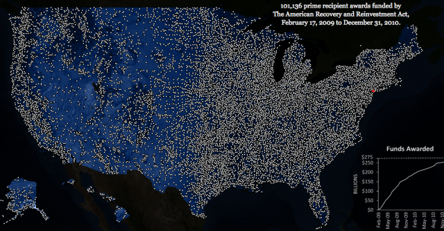
Going to one of Tufte’s lectures has probably been one of the most positively influential events in my attempted-pursuit of information design. That said, his “Recovery Lights” map, which purports to show stimulus projects over time across a map of the United States, seemed to me like an example of what a Tufte-inspired design should not be: Lots of extraneous ink and attractive, without substance. Because every project seems to be a similarly-sized light, the map is arguably misleading as small projects have as much weight as extremely expensive projects, a problem compounded with the lack of any context, such as population density or regional unemployment rates. And having had to look through the stimulus data many times over for ProPublica’s Recovery Tracker, I’m very skeptical that what’s defined as a discrete “award” is consistent across the board.

Pingback: download triplets of belleville