I’ve been a paying Flickr member since late 2009, but this year was going to be my last. I believed this even after I forgot to change my billing settings and Flickr auto-renewed me into 2015, because it seemed chances were good that Flickr, a long-neglected and resource intensive property, would get the ax soon and I’d get a refund anyway.
Flickr’s been a great place to organize and store photos, but its outdated, lackluster design – mostly unchanged for nearly a half decade – made it unappealing for actually viewing photos. In addition to paying the annual $24.95 fee for Flickr’s pro membership, I bought third-party iOS apps just to browse my own Flickr collection. So leaving Flickr would’ve been inconvenient, but only in the way that having to move my dusty box of photos from one attic to another would be inconvenient.
So, of course, I was one of the jaded naysayers who, after hearing Tumblr was bought by Yahoo for $1.1 billion, thought:
- Hello Tumblr, welcome to retirement
- Goodbye Flickr, that’s $1 billion that won’t be going to your modernization
But Yahoo’s (quite abrupt) launch of a “better, brighter” redesign will keep me a happy member for at least the next couple of years. For the first time in about 4 years of being a paid member, I’ll actually want to use Flickr to show my photos.
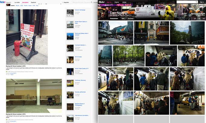
Before this week’s redesign, Flickr’s sparse, thumbnail-heavy design – which may have been sensible five years ago, when bandwidth was more expensive – made the service unappealing for easy browsing of images. Here’s what my profile page looked like in April (courtesy of web.archive.org, which apparently captured it in French) compared to post-redesign:

Note: Flickr’s JavaScript hides the photos that are outside the browser’s current viewing area, which is why you see all those gray boxes at the bottom.
If you haven’t been actively using Flickr (and based on ongoing reports of Flickr’s demise, this is likely the case), Flickr’s redesign may seem like just catch-up to the photo-heavy designs long adopted by Google+ and, well, Tumblr. But it was an absolutely critical improvement for Flickr. Flickr has had more than enough features for managing and discussing photos (compared to non-photo-centric services), so the fact that the redesign is mostly a skin-deep overhaul is just fine (for now).
This seems almost too obvious to state, but the appeal of photography is rooted in the immediacy and attractiveness of its visual display. A wedding photographer told me that the key to his success was that he took the time to create a printed book of photos for his clients instead of just handing them a photo DVD. Because while photo DVDs hold many more photos, having to pop in the DVD and browse photo files with the computer’s default photo program was a terrible viewing experience. And so clients rarely browsed photo DVDs for leisure. And more importantly, to the photographer dependent on referrals, customers rarely showed the DVD photos to visiting friends and family.
The Flickr “photostream” now actually looks and navigates like a photostream. There’s a few JavaScript issues and performance kinks to work out, but I can’t overstate how much more nicer the redesign is, and I wonder how much Yahoo! CEO Marissa Mayer had to do with pushing it through. When she was a vice president at Google, Mayer was well-aware of how sensitive users are to speed – a half-second delay in retrieving search results resulted in a 20% drop in revenue and traffic from users. I imagine this sensitivity is even more acute when it comes to visual streams, in which we expect to experience images as fast as the light hits our retinas. In 2010, Mayer took some good-natured ribbing about how stingy Google’s (text) search results were. While she didn’t go into the justification behind Google’s only-10-links-per-page design, she spoke proudly of a new infinite scroll feature in Google Image Search, which allowed users to scroll thousands of images quickly.
“People are able to scan lots of visual information, really fast,” Mayer said. “[But] reading a search result may take longer.”
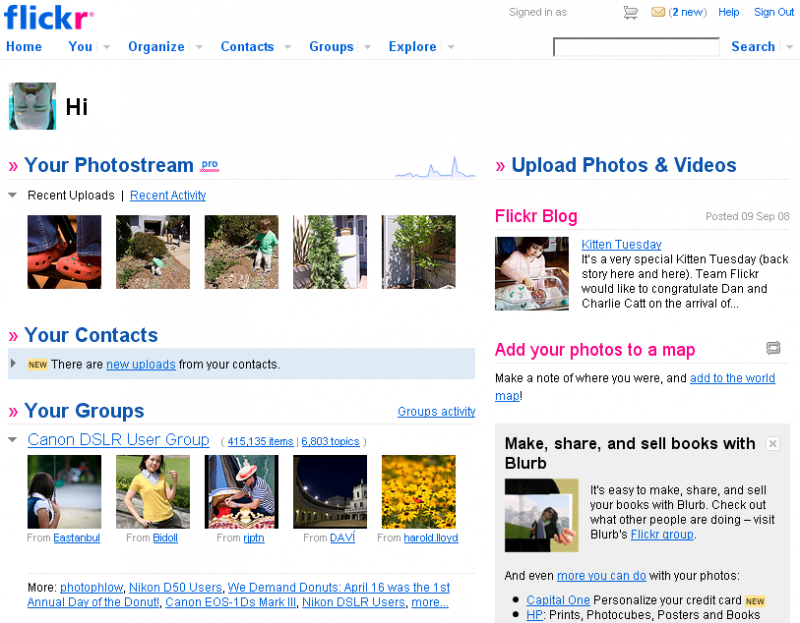
The redesign improves Flickr’s viability as a social network, too. Even though Flickr had one of the earliest photo communities and discussion groups, the homepage did very little to surface those interactions. Instead, the default user homepage put priority on showing users their own most recently uploaded photos, which, if you hadn’t uploaded photos in weeks or months, was not a good use of the homepage. There were subsections for the photos uploaded by your groups and friends, but again, the thumbnail-focused design made this unusable. I almost never clicked through the thumbnails of other people’s photos because it was impossible to know from 75×75 pixels if the photo was worth looking at.
Here’s what the Flickr homepage looked like for nearly five years after the 2008 redesign, (courtesy of CNET):
Here’s what logged-in users see on the Flickr homepage today:
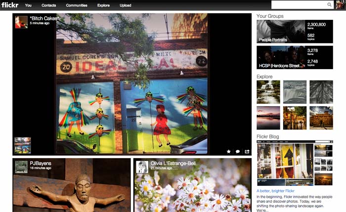
Right now, it seems that Flickr is just showing the most recent photos from my network, without curating them with data metrics (such as number of views, favorites, comments) to ensure that the photo is also interesting. But I’m already more interested in my network than I’ve ever been.
When Flickr introduced its new mobile app late last year, that actually bolstered my opinion that the service was in its final year, because the new app seemed like the very epitome of a hasty ohmygod-lets-just-do-something plan: “maybe if we add filters, users will come back to us.” But this week’s changes give some assurance that someone in charge really cares about making Flickr relevant again. The photo-centric design and the (practically) limitless storage space are absolutely critical to the way people use photo services. Flickr’s previous limit of 200 photos for non-pro users was made Flickr completely useless in a technological era where the average smartphone user produces 200 (relatively) likeable photos in a couple of weeks.
And the redesign makes Flickr a real home for photos, not just a storage box. For awhile, I’ve half-assedly maintained a set of my “favorite” photos, about 500 of the 8,500 I’ve dumped on Flickr so far. My favorites set wasn’t a place to show off (the album design was as plain as the old photostream design), but merely triage for my photo archive before I finally got around to quitting Flickr to move to an attractive portfolio site. But with the new design, my photoset pages are just about good enough to be portfolio pages:
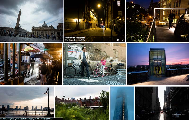
Part of my “favorites” set
To give you an idea of how little I navigated my own Flickr collections – i.e how important the interface is to the photo browsing experience – my first thought when looking through my set of favorites after the redesign wasn’t, “These photos look nice,” but: “Wow, I don’t even remember taking some of these photos.”
Even though the Tumblr acquisition is the big news this week, kudos to the Flickr team for their own big changes and their big ambitions.
Pingback: How they did it: Flickr.com Redesign | Webdesigntuts+
Pingback: How They Did It: Flickr.com Redesign | Directory Net
Pingback: How They Did It: Flickr Redesign | DK Studio