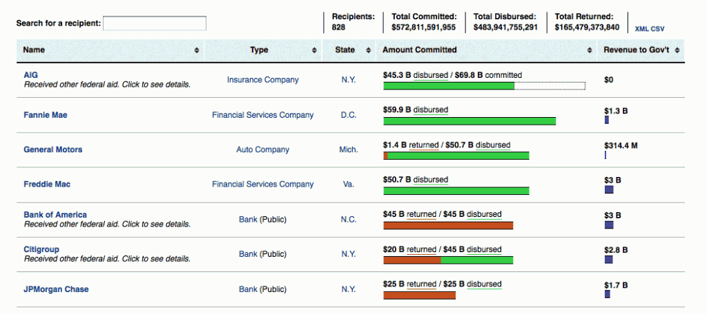
Today, my ProPublica colleague Paul Kiel and I put out some graphical revisions to PP’s bank bailout tracking site, including our master list of companies to get taxpayer bailout money:
Nothing fancy, mostly made the numbers easier to find and compare. The site itself has been far-from-fancy at its inception, since it was my first project after taking a crash course on Ruby on Rails. Back when the bailout was first announced in Q4 2008, the Treasury declined to name the banks it was doling taxpayer money to, for fear that non-listed banks would take a hit in reputation. Paul was one of the first few people to comb through banks’ press releases and enter them into a spreadsheet. His list of the first 26 – put into a simple html table – was a pretty big hit.
As the list grew into the dozens and hundreds, it became more cumbersome to maintain the static list, which was nothing more than the bank’s name, date of announcement, and amount of bailout. Plus, it was no longer just one bailout per company; Citigroup and Bank of America were beneficiaries of billions of dollars through a couple other programs.
So, I proposed a bailout site that would allow Paul to record the data at a more discrete level…up to that point, for example, most online lists showed that AIG had several dozen billion dollars committed to it, but not the various programs, reasons, and dates on which those allocations were made. A little anal maybe, but it gave the site the flexibility to adapt when the bailout grew to include all varieties of disbursements, including to auto parts manufacturers and mortgage servicers, as well as the money flow coming in the opposite direction, in the form of refunds and dividends.
I saw the site as more of a place for Paul to base his bailout coverage on (he’s been doing an excellent job covering the progress of the mortgage modification program), as I assumed that in the near future, Treasury would have its own, easy-to-use site of the data. Unfortunately, that is not quite the case, nearly a year and a half later. Besides some questionable UI decisions (such as having the front-facing page consist of a Flash map), the data is not put forth in an easily accessible method. It could be that I need to take an Excel refresher course here, but trying to sort the columns in these Excel spreadsheets just to find the biggest bailout amount, for example, throws an error.
Only in the past couple of months did Treasury finally release dividends in non-pdf form, and even then, it’s still a pain to work with (there’s no way, for example, to link the bank names in the dividends sheet to the master spreadsheet of bailouts). I would’ve thought that’d be the set of bailout data Treasury would be most eager to send out, because it’s the taxpayers’ return on investment. But, as it turns out, there is a half-empty perspective from this data (such as banks not having enough reserves to pay dividends in a timely fashion), one that would’ve been immediately obvious if the data were in a more sortable form.
ProPublica’s bailout tracking site doesn’t have much data other than the official Treasury bailout numbers; there’s all kinds of other unofficial numbers, such as how much each bank is giving out in bonuses, that people are more interested in. American University has gathered all kinds of financial health indicators for each bailout bank, too. There’s definitely much more data that PP, and other bailout trackers need to collect to provide a bigger picture of the bailout situation. But for now, I guess it’s a small victory to be one of the top starting points to find out just exactly where hundreds of billions of our taxes went to. And the why, too; Paul’s done a great job writing translations of the Treasury’s official-speak on each program.
ProPublica’s Eye on the Bailout

