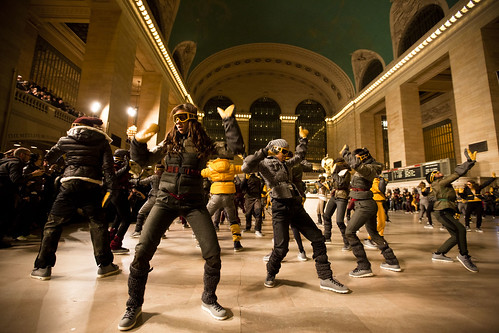
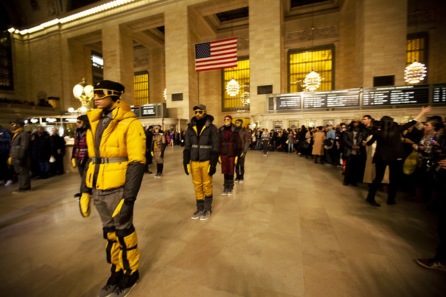
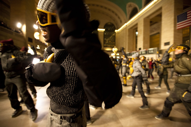
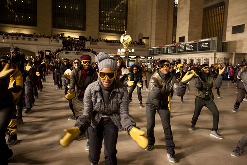
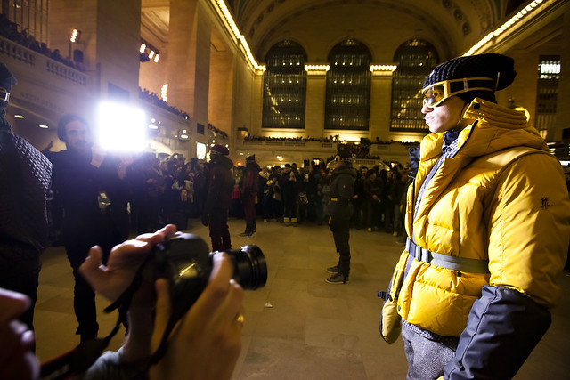
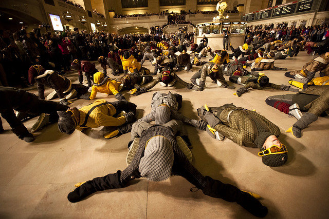
Usually it’s pretty easy to get to your train at Grand Central, unless someone decides to hold a fashion event in the main terminal. I was lucky enough to have been in the front when this fashion event’s organizers started making room for the 150+ dancers, I put a bunch of photos in this Flickr set.
The New York Times wrote about how difficult it was to put together a show in a landmark like Grand Central post-9/11:
“The city was very specific about not mentioning flash mob,†Mr. Coppers said. Still, a flash mob is what it looked like at 7:25 to the unsuspecting travelers scanning the announcement board for their track numbers and reading about ice conditions on the Hudson shutting down the Haverstraw-Ossining Ferry.
They suddenly found themselves infiltrated by a large and highly coordinated group of what appeared to be chic aliens, appearing out of nowhere to take over the terminal. There were 363 of them, 163 wearing goggles and vividly colored ski clothes and another 200 hired to pass as ordinary travelers.
At a signal from Etienne Russo, the Belgian mastermind of the Moncler Grenoble event (and the man who once had a Swedish iceberg cut into pieces and shipped to the Grand Palais in Paris for a Chanel show), the extras began clearing the concourse for what was surely the most ambitious and spectacular event of Fashion Week and the only one impossible to transplant to any other place.
“For months I thought it was not doable, but I was obsessed,†Mr. Russo had said. Six hours before the show began, he was pacing around a rehearsal studio in a warehouse set by the East River in the outer reaches of Brooklyn, as the choreographer Luam put her dancers — some trained but many not — through their paces.
“We wanted to do something in Times Square, but because of what happened, that’s impossible,†Mr. Russo added, referring to the attempted car bombing. “But as soon as we came to Grand Central, I said it has to be here.â€
Some video:
Woah! The dancers are all wearing the Native Fitzsimmons!
Hi there, What a lucky thing you were carrying a camera for these shots. Fun!
Actually I just wanted to say what an amazing job you did putting together that Museum Guide for the city on Reddit. It looks like an enormous amount of work. My one suggestion to make it visually clearer is to do another different color for the freebies — probably a bright warm color to stand out from the blue and green.
Thank you for the complement and the suggestion…yeah, the colors do look a bit tacky. Green made sense because it means money, and orange is a little bit too polar-opposite for it. Yellow might be hard for the color blind…and so blue seemed good for now…I’d like the free and suggested to remain similar in color just because for many people, suggested is as good as free. But I’ll probably change it up when I have a little more time later. Thanks for the feedback!