 About a year ago I threw up a long, rambling guide hoping to teach non-programming journalists some practical code. Looking back at it, it seems inadequate. Actually, I misspoke, I haven’t looked back at it because I’m sure I’ll just spend the next few hours cringing. For example, what a dumb idea it was to put everything from “What is HTML” to actual Ruby scraping code all in a gigantic, badly formatted post.
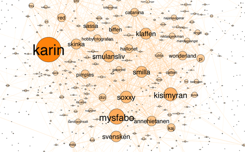
The series of articles have gotten a fair number of hits but I don’t know how many people were able to stumble through it. Though last week I noticed this recent trackback from dataist, a new “blog about data exploration” by Finnish journo Jens Finnäs. He writes that he has “almost no prior programming experience” but, after going through my tutorials and checking out Scraperwiki, was able to produce this cool network graph of the Ratata blog network after about “two days of trial and error”:

Mapping of Ratata blogging network by Jens Finnäs of dataist.wordpress.com
I hope other non-coders who are still intimidated by the thought of learning programming are inspired by Finnas’s example. Becoming good at coding is not a trivial task. But even the first steps of it can teach a non-coder some profound lessons about data important enough on their own. And if you’re a curious-type with a question you want to answer, you’ll soon figure out a way to put something together, as in Finnas’s case.
ProPublica’s Dollars for Docs project originated in part from this Pfizer-scraping lesson I added on to my programming tutorial: I needed a timely example of public data that wasn’t as useful as it should be.
My colleagues Charles Ornstein and Tracy Weber may not be programmers (yet), but they are experienced enough with data to know its worth as an investigative resource, and turned an exercise in transparency into a focused and effective investigation. It’s not trivial to find a story in data. Besides being able to do Access queries themselves, C&T knew both the limitations of the data (for example, it’s difficult to make comparisons between the companies because of different reporting periods) and its possibilities, such as the cross-checking of names en masse from the payment lists with state and federal doctor databases.
Their investigation into the poor regulation of California nurses – a collaboration with the LA Times that was a Pulitzer finalist in the Public Service category – was similarly data-oriented. They (and the LA Times’ Maloy Moore and Doug Smith) had been diligently building a database of thousands of nurses – including their disciplinary records and the time it took for the nursing board to act – which made my part in building a site to graphically represent the data extremely simple.
The point of all this is: don’t put off your personal data-training because you think it requires a computer science degree, or that you have to become great at it in order for it to be useful. Even if after a week of learning, you can barely put together a programming script to alphabetize your tweets, you’ll likely gain enough insight to how data is made structured and useful, which will aid in just about every other aspect of your reporting repertoire.
In fact, just knowing to avoid taking notes like this:
Colonel Mustard used the revolver in the library? (not library)
Miss Scarlet used the Candlestick in the dining room? (not Scarlet)
“Mrs. Peacock, in the dining room, with the revolver? “
“Colonel Mustard, rope, conservatory?”
Mustard? Dining room? Rope (nope)?
“Was it Mrs. Peacock with the candlestick, inside the dining room?”
And instead, recording them like this:
| Who/What? |
Role? |
Ruled out? |
| Mustard |
Suspect |
N |
| Scarlet |
Suspect |
Y |
| Peacock |
Suspect |
N |
| Revolver |
Weapon |
Y |
| Candlestick |
Weapon |
Y |
| Rope |
Weapon |
Y |
| Conservatory |
Place |
Y |
| Dining Room |
Place |
N |
| Library |
Place |
Y |
…will make you a significantly more effective reporter, as well as position you to have your reporting and research become much more ready for thorough analysis and online projects.
There’s a motherlode of programming resources available through single Google search. My high school journalism teacher told us that if you want to do journalism, don’t major in it, just do it. I think the same can be said for programming. I’m glad I chose a computer field as an undergraduate so that I’m familiar with the theory. But if you have a career in reporting or research, you have real-world data-needs that most undergrads don’t. I’ve found that having those goals and needing to accomplish them has pushed my coding expertise far quicker than did any coursework.
If you aren’t set on learning to program, but want to get a better grasp of data, I recommend learning:
- Regular expressions – a set of character patterns, easily printable on a cheat-sheet for memorization, that you use in a text-editor’s Find and Replace dialog to turn a chunk of text into something you can put into a spreadsheet, as well as clean up the data entries themselves. Regular-expressions.info is the most complete resource I’ve found. A cheat-sheet can be found here. Wikipedia has a list of some simple use cases.
-
Google Refine – A spreadsheet-like program that makes easy the task of cleaning and normalizing messy data. Ever go through campaign contribution records and wish you could easily group together and count as one, all the variations of “Jon J. Doe”, “Jonathan J. Doe”, “Jon Johnson Doe”, “JON J DOE”, etc.? Refine will do that. Refine developer David Huynh has an excellent screencast demonstrating Refine’s power. I wrote a guide as part of the Dollars for Docs tutorials. Even if you know Excel like a pro – which I do not – Refine may make your data-life much more enjoyable.
If you want to learn coding from the ground up, here’s a short list of places to start:
- Lifehacker’s “Full Beginner’s Guide” – a four day guide that covers the very basics to how to write a simple guessing game. It’s in Javascript, but as you’ll hear plenty of times from veterans, it really doesn’t matter what language you start out with.
- The Pragmatic Programmer’s Guide to Programming Ruby – this covers an older version of Ruby, but is still a great comprehensive, browser-friendly book.
- Learn to Program (also in Ruby) by Chris Pine – Written in 2004, this is still an elegant beginner’s guide
- Invent Your Own Computer Games With Python – You may not be interested in writing game software, but the same programming techniques apply in that field as they do anywhere else. This guide covers all the fundamentals and gives you great project examples.
- ScraperWiki has a massive collection of web-scraping scripts for your perusal, and is where the dataist’s Finnäs learned from example. ScraperWiki has a set of python tutorials, too.
- Here’s a giant list of free programming books.
- Visit the learnprogramming subforum in Reddit to find a small, but active community of beginners who aren’t afraid to start the most basic of discussions with the forum’s programming experts. StackOverflow is the single best site for specific questions or problems; often, you can Google your exact problem and a relevant StackOverflow discussion will be at the top.
- And you can always refer back to my four-part programming tutorial from last year, which aims to cover HTML to writing Ruby to scrape websites. I also wrote a series of tutorials (with complete code) on how I collected data for Dollars for Docs, including how to scrape from websites, Flash applications, PDFs, and even image files (the solution is specific to one kind of format, so I will gladly welcome anyone else to generalize it).


